Loop vs spine rack layouts for retail traffic
Every square foot of a retail floor is a competing bid for the shopper’s attention, and the two layouts that fight for that real estate most often are the loop, or racetrack, and the spine.
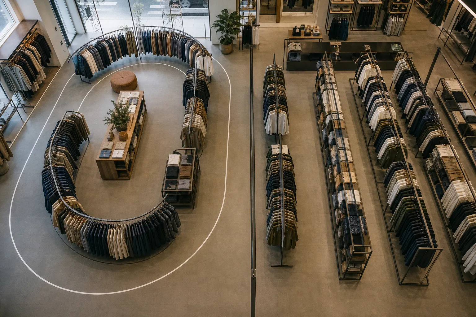
The Real Estate Battle Happening in Your Aisles
We see this tension play out in every store we walk into: a retailer wants customers to discover more merchandise, but they also want them to find what they came for. The floor plan quietly decides which of those two goals wins.
Compare car rental deals in United Kingdom
See available offersPartner link — DiscoverCars comparisonGet the racetrack right and you engineer a slow, deliberate journey that lifts dwell time and impulse conversion. Get the spine right and you give a mission-driven shopper a fast, frictionless path to the SKU already sitting on their list. The trick is knowing which one your category, your customer, and your building actually reward — and almost nobody gets that decision right on the first draft of a planogram.
The choice is not simply about whether the fixtures look orderly. It determines where customers slow down, which racks become visible from a distance, how often shoppers cross the same promotional zone, and whether a full basket feels like a natural result of browsing or an obstacle course. In commercial display planning, traffic flow is not background geometry. It is part of the selling system.
The Mechanics of the Racetrack: Maximizing Dwell Time and Discovery
The racetrack, also called the loop layout, is one of the oldest shopper-flow tricks in the visual merchandising playbook, and we still lean on it because it works on a basic piece of human behavior: if you make the path a circle, the shopper has to travel a larger share of the selling floor before reaching the registers or completing the trip.
The canonical example is IKEA, where arrows, room sets, and a deliberately circuitous route push shoppers past kitchen vignettes, bedroom displays, and a curated marketplace of impulse buys before they ever see a checkout. Kohl’s runs the same playbook at a softer tempo, using a racetrack to glide shoppers between apparel, beauty, and home departments so each transition surfaces a category the customer did not originally plan to browse.
A loop does not have to be a literal painted path or a line of arrows. In a smaller store, it can be created through the placement of perimeter fixtures, angled garment racks, department breaks, and a sequence of visual anchors that keeps the shopper moving in one direction. The customer should feel that the next zone is naturally ahead, not that the retailer has built a maze and is waiting to see whether anyone notices.
Where this layout earns its keep is dwell time. The longer a customer walks the floor, the more exposed they are to endcap displays, retail signage, cross-merchandised pairings, and themed product presentations. The racetrack multiplies all of those exposures because it gives each presentation another chance to be seen from a different angle.
That matters most when the purchase is not fully specified before the visit. Seasonal merchandise, lifestyle categories, gifting, home décor, fashion, and adjacent accessories all benefit from a customer seeing a complete story rather than one isolated product. A garment rack positioned on the loop can introduce a collection, while a nearby table or wall presentation supplies the second and third item that turn a single purchase into an outfit or a room solution.
The cost of that exposure is friction. A customer who came in for one item and has to walk the entire loop to find it feels steered, and that feeling bleeds straight into satisfaction and repeat visits. We have watched retailers lose mission traffic because the racetrack that built their average basket also bruised their most time-sensitive shoppers. Bruised shoppers do not come back next month simply because the store had a higher number of attractive displays.
The loop therefore needs release points. A customer should be able to reach a service desk, fitting room, key category, or checkout without abandoning the whole experience or cutting through a fixture cluster. Those shortcuts do not weaken the racetrack; they make it usable. A loop with no escape route is a control mechanism. A loop with carefully placed exits is a browsing framework.
If your business lives on discovery, the racetrack is a slow-motion sales engine. If your business lives on retrieval, it is a customer-experience tax you keep paying.
What makes a loop feel intentional
The best racetrack layouts have a rhythm. A high-impact display appears at the entrance or first turn, but the retailer does not spend every few feet shouting for attention. Product density, fixture height, lighting, and category transitions do some of the work quietly.
For commercial racks, that usually means varying the visual weight of the floor:
- Use lower or more open fixtures where the shopper needs to understand the next department.
- Place denser garment storage and back-stock capacity away from the primary sightline so the sales floor does not read as a warehouse.
- Give endcaps a clear role: newness, seasonal relevance, outfitting, or a specific basket-building relationship.
- Avoid repeating the same rack type around the entire circuit. Repetition makes the path legible, but monotony makes it feel longer.
- Keep a few visual pauses in the loop so customers can stop without blocking the people behind them.
The racetrack works when the shopper keeps discovering reasons to continue. It fails when the shopper is merely being marched past merchandise.
The Spine Strategy: Balancing Structured Navigation with Browsing
The spine layout splits the difference between full structure and full exploration, and we tend to recommend it for stores where customers arrive with a partial list and a partial sense of curiosity. A single main aisle — the spine — runs from the front door to the back wall, and secondary aisles branch off perpendicular to it. Each branch can hold a department, a category zone, or a curated vignette.
Bookstores, specialty retailers, fashion stores, and most mid-size department stores can build a practical floor plan around this skeleton because it lets a customer pivot into deep browsing without ever losing the thread back to the front door. The customer sees the main route, understands where departments begin, and can decide how far to explore.
That sense of orientation is the spine’s greatest strength. It reduces the mental work of navigating the store. Customers can move directly to a known category, while the branch entrances offer controlled invitations to browse. In a garment store, for example, the spine might lead toward denim, occasionwear, or basics, with each secondary zone opening into a more focused rack arrangement. The customer is not forced to examine every category, but the categories remain visible enough to create useful interruptions.
The spine is also where endcap merchandising shines brightest. Because shoppers walk the central route in both directions on the way to their target department, every perpendicular aisle becomes a corridor of intercepts. Displays at the mouth of each branch perform two jobs at once: they act as billboards visible from the spine and as the first touchpoint inside the department.
If you have a promotional category, a seasonal hero, or a new arrival you need to push in volume, those endcaps at the spine intersections are among the highest-value pieces of real estate on the floor. But the endcap only earns that value if customers can understand it in motion. A display that requires the shopper to stop, turn sideways, and decode a crowded message is not doing the job of a traffic-facing presentation.
The compromise is congestion. The spine is a single chokepoint by design, and during peak hours the central corridor can stack up with baskets, carts, and stop-and-look browsers. That is exactly why main-aisle width is non-negotiable in a spine plan. A route that works in an empty store can collapse as soon as one shopper pauses beside a rack and another tries to pass with a cart.
We have also seen spine layouts become functionally identical to a tight grid when the secondary aisles are too short or too narrow. At that point, the retailer loses the exploratory upside without gaining anything in navigation speed. If you build a spine, you commit to it: comfortable branch aisles, clear sightlines, readable department entrances, and a corridor wide enough that two shoppers can pass without either one having to swerve.
Spine versus grid: the distinction that matters
The grid layout is efficient, familiar, and easy to extend. It works particularly well when the store carries a broad range of similar products and customers expect to compare one fixture row with the next. But grid efficiency can become visual sameness. Every aisle begins to look like the aisle beside it, and the customer has to work harder to remember where they have already been.
A spine gives the store a hierarchy. There is a primary route and there are secondary decisions. That hierarchy makes it easier to use rack placement as a form of navigation rather than treating every fixture as an isolated sales unit.
The difference is subtle on a planogram and obvious on the floor:
| Layout characteristic | Spine layout | Grid layout |
|---|---|---|
| Primary navigation | One dominant route with branches | Several parallel routes of similar importance |
| Customer orientation | Strong; the main corridor remains a reference point | Weaker when aisles look repetitive |
| Browsing behavior | Intentional detours into departments | Broad comparison across repeated rows |
| Best use of endcaps | Intercepts at branch entrances | Repeated promotional moments along parallel aisles |
| Main risk | Central congestion | Disorientation and visual sameness |
| Rack planning priority | Keep branch mouths visible and accessible | Maintain consistent spacing and readable aisle identity |
A spine layout rewards you when half your customers came to browse and half came to buy something specific. It punishes you the moment you let those two intentions share the same six feet of corridor.
Critical Aisle Dimensions and ADA Compliance Standards
Whatever layout you pick, aisle dimensions will either make it or break it, and this is the part of the floor plan we red-line most aggressively. Accessibility requirements establish a legal baseline, but not every convenient planning number used by retailers is a legal minimum.
Under applicable ADA accessibility requirements, an accessible route generally needs at least 36 inches of clear width for a single wheelchair passage. Where shoppers need to pass one another or turn around, a 60-inch clear area may be required in the relevant configuration. Those dimensions concern unobstructed clear space, not the nominal distance between two lines on a drawing. A fixture foot, overhanging rack arm, display bin, sign, or promotional basket can reduce the usable width even when the measurement looks compliant on paper.
The exact application depends on the route, the building, the fixture arrangement, and other applicable accessibility and building requirements. Local codes and the project’s accessibility review still matter. A retailer should not treat the ADA figure as permission to design every aisle at the smallest possible width. Legal compliance is the floor. It is not a merchandising strategy.
Above that legal floor, retail planning guidelines give us more useful operating bands. These are design recommendations for traffic flow, cart movement, browsing behavior, and fixture access — not universal legal thresholds:
- Main aisles and primary traffic paths: plan around 4 to 6 feet, with wider dimensions where shopping carts, high traffic, or two-way movement are expected. Traditional grocery environments commonly require 8 to 10 feet in key main aisles.
- Secondary browsing aisles between fixture rows: plan around 3 to 4 feet for ordinary retail browsing. Grocery and big-box environments often benefit from 5 to 6 feet where carts and opposing traffic are common.
- Merchandise-only or low-density browsing aisles: 30 to 36 inches may be workable in limited, low-conflict zones, but these are planning guidelines, not ADA legal minimums. They should not be used where two shoppers need to meet, where carts circulate, or where an accessible route passes.
The distinction matters because a narrow merchandise aisle can be a reasonable planning choice in one location and a serious accessibility or operational problem in another. A short seasonal rack positioned at the back of a low-traffic boutique does not behave like a permanent fixture row sitting beside a fitting-room queue.
| Layout element | Applicable legal reference | Planning guideline | Why it matters |
|---|---|---|---|
| Accessible single-passage route | 36 in clear width where the ADA requirement applies | Treat this as a baseline, not a target for every retail aisle | Preserves single wheelchair passage and accessible movement |
| Turning or passing area | 60 in clear area where the ADA configuration requires it | Add generous clearance at turns, route intersections, and high-conflict zones | Allows turning, passing, and changes in direction |
| Main retail aisle | Not automatically defined by the 4–6 ft planning band | 4–6 ft; often 8–10 ft in traditional grocery main aisles | Carries peak traffic, carts, and customers moving between departments |
| Secondary browsing aisle | Not automatically defined by the 3–4 ft planning band | 3–4 ft; often 5–6 ft where carts or heavy two-way flow are expected | Supports browsing between fixture rows |
| Merchandise-only aisle | 30–36 in is not an ADA legal minimum | Use only as a carefully controlled low-density planning range | May work for limited browsing but can fail under two-way traffic |
These numbers are not arbitrary. An aisle that is even 6 to 12 inches tighter than planned can look perfectly acceptable on a CAD file and choke the moment two carts try to pass each other during a Saturday rush. The problem is not only physical. Customers read a crowded aisle as a warning that stopping will inconvenience other people, so they keep moving. That is the opposite of what a discovery-led layout needs.
We have lost count of how many times a chain has called us in to fix a “low conversion” problem only to discover that the bottleneck was, very literally, a bottleneck in aisle three. Before changing the signage, product assortment, or promotional message, measure the route with the fixtures actually specified. A rack shown as a clean rectangle on a plan may have deeper feet, angled arms, garment overhang, or a neighboring display that narrows the path in practice.
Measure clear width, not drawing width
A reliable rack layout review should account for the parts of the fixture that occupy space outside its main footprint. In apparel, this includes garment sleeves extending toward the aisle, shoppers pulling items outward to inspect them, and stock carts temporarily parked beside the rack. In home or seasonal retail, it includes baskets, low tables, boxed merchandise, and feature displays that drift into the circulation path during a promotion.
The measurement should also be tested under use, not only under empty-floor conditions. Put a cart at the likely stopping point. Place a customer-facing display at the endcap. Open a fitting-room door if the route passes nearby. Then look at whether the remaining clear width still supports the intended traffic pattern.
Aisles are behavior spaces. The useful question is not “Can someone technically get through?” It is “Can someone get through without abandoning the product they are looking at, turning sideways, or feeling that they are in the way?”
Common Planning Pitfalls: Why Narrow Aisles Kill Conversion
The single most expensive mistake we see in retail floor plans is the silent undersizing of aisles by six to twelve inches. On a paper plan it is easy to miss. On the actual floor, at peak traffic, it is the difference between a customer stopping to study an endcap and a customer backing away from a queue they do not want to fight through.
That hesitation shows up as lost dwell time, fewer cross-merchandised add-ons, and a checkout line that looks longer than it actually is because the approach to it is congested. Narrow retail rack placement does not merely slow movement. It changes the shopper’s willingness to browse.
The second pitfall is mixing two layouts halfway. A racetrack with a spine bolted across the middle, or a spine with a circular detour at the back of the store, sounds hybrid and sophisticated on paper. In practice, it can give the shopper the worst of both worlds: no clean walking rhythm, conflicting visual cues, and no clear advantage from either system.
A hybrid can work, but it needs a dominant logic. The main route should still be obvious, and the loop should be created through department sequencing, angled fixtures, or a controlled return path rather than through arbitrary bends. We have dismantled hybrids more often than we have built them. If the building forces you into one pattern, commit to it; do not let the CAD file convince you that a third option will solve every problem at once.
Third, watch the sightlines at the mouth of every secondary aisle. A rack placement strategy that puts tall gondolas perpendicular to the spine blocks the customer from seeing what is down that branch, and the branch dies even if the merchandise inside it is strong.
If you are running a spine layout, keep the first few feet of each secondary aisle low-profile or angled so the customer can see a hero display from the spine. Then transition to full-height fixtures once the shopper has committed to the walk-in. This is where SKU density decisions start to matter: a tightly packed interior aisle reads as a serious browsing destination, while a cluttered or visually closed entrance reads as a dead end.
Other recurring failures are less dramatic but just as costly:
1. The entrance is overloaded. Retailers place too many racks, promotional tables, and signs in the decompression zone immediately inside the door. Customers have not yet adjusted to the store, and the first thing they encounter is a decision they cannot comfortably make. Leave enough room for arrival, orientation, and the first turn.
2. The checkout route is treated as leftover space. A shopper who can reach the merchandise but cannot approach the register without crossing a congested queue will remember the friction. The route to checkout needs its own capacity, especially in a spine layout where the central aisle carries several competing movements.
3. Tall fixtures erase the department map. Height can increase storage and presentation capacity, but a continuous wall of tall racks removes visual landmarks. Use height selectively. The customer should be able to understand where the next category begins before entering it.
4. Promotional fixtures migrate into circulation. A temporary bin or freestanding rack often begins with a carefully measured position and ends up six inches farther into the aisle because staff need access behind it. Build operational behavior into the plan. If employees cannot replenish a fixture without moving it, the intended traffic width will not survive the first week.
5. The rack faces the wrong direction. A display can be physically close to the main path and still invisible to it. The customer’s approach angle, lighting, product facing, and the moment at which the display enters peripheral vision all affect whether the rack works as an intercept.
6. The plan ignores stopping behavior. Shoppers do not move through a store as clean dots on a diagram. They stop to compare sizes, answer a message, wait for a companion, check a label, or hold a garment against themselves. Leave room for those pauses at the edges of traffic rather than placing the most compelling product where stopping blocks everyone else.
The geometry should be tested against the real customer pathing, not an idealized one. Walk the store from the entrance with an empty basket, then with a cart, then while carrying a garment or boxed product. Notice where you naturally slow down and where another person would have to move around you. Those points are more informative than a plan that assumes every shopper maintains a constant speed.
Matching Layouts to Customer Intent and Product Categories
Here is the decision rule we use with our clients, and it has held up across apparel, home goods, books, and grocery. If your customer is mostly on a mission — they know what they want, they want it fast, and your goal is basket completion and visit frequency — build a spine. If your customer is mostly in discovery mode — they have time, they have an open list, and your goal is exposure and basket expansion — build a racetrack.
Most mid-size retail clients sit somewhere between those extremes. That is when we build a hybrid in which the spine is the structural skeleton, but a loop is created by how the secondary departments are merchandised, signed, and angled at their termini. The point is not to name the layout correctly. The point is to make the customer’s next move obvious without making every move mandatory.
A few practical tiebreakers have saved us from expensive second-guessing:
- Apparel and fashion: generally racetrack-leaning. Outfitting and lifestyle categories thrive on cross-shopping, and the slow walk past coordinated product presentations builds basket size without feeling like a hard upsell. The loop still needs shortcuts to fitting rooms, core basics, and checkout.
- Grocery and convenience: usually spine-led, with clear category anchoring at each branch. Mission shopping dominates, and cart logistics demand wider primary aisles. Promotional displays can interrupt the route, but they should not make the route uncertain.
- Books, hobby, and specialty retail: spine with strong endcap storytelling. Browsers will dive down a branch on their own if the entrance is compelling enough and the customer can see the category logic from the main aisle.
- Big-box and home, including IKEA-style environments: racetrack is often the operating system, with department-specific exits for customers on a mission for one category. The exits are not a concession; they are what keeps the full journey from feeling coercive.
- Pop-up and small-format boutiques: usually spine-led. Floor footage is too tight to spend on a racetrack that needs both width and length, and a clear route helps a small assortment feel more complete rather than compressed.
- Seasonal and gifting categories: racetrack-leaning when the store can support discovery. These products benefit from adjacency and narrative, but the layout should make it easy to leave the seasonal zone without retracing every step.
- High-density basics and replenishment products: spine or grid. Customers are comparing, retrieving, and returning frequently, so legibility and direct access matter more than a long sequence of exposures.
The final decision should also account for the building. A beautiful loop on a rectangular plan can become awkward around columns, low ceilings, irregular entries, or a checkout that cannot move. A spine can be more forgiving in a narrow footprint, but only if the central route has enough capacity and the branch entrances do not become storage points. Existing doors, fitting rooms, service counters, stockroom access, and emergency routes are not minor drafting details. They determine whether the layout will remain stable after opening.
The metric we close every layout review on is the same one we open with: did we increase dwell time without crushing task completion, and is the applicable accessibility clearance preserved throughout the route rather than merely assumed from the nominal fixture spacing?
Those questions keep the conversation in the right place. A retailer can have attractive racks, strong product, and excellent signage, but the customer still has to move through the store comfortably enough to notice any of it. If the answer is no, you do not have a merchandising problem. You have a geometry problem, and you fix it before you touch another sign or reorder another display.
The best answer to retail loop layout vs spine layout is rarely ideological. It is a decision about customer intent, category behavior, building constraints, and the amount of friction the business can afford. Use the racetrack when discovery is the sale. Use the spine when navigation is part of the promise. And when the store needs both, give one system clear authority instead of asking the shopper to decode a compromise.