Retail store layouts: which floor plan fits your racks
Impulse purchases account for up to 40% of all retail sales, and roughly 80% of those happen inside a physical store, not online.
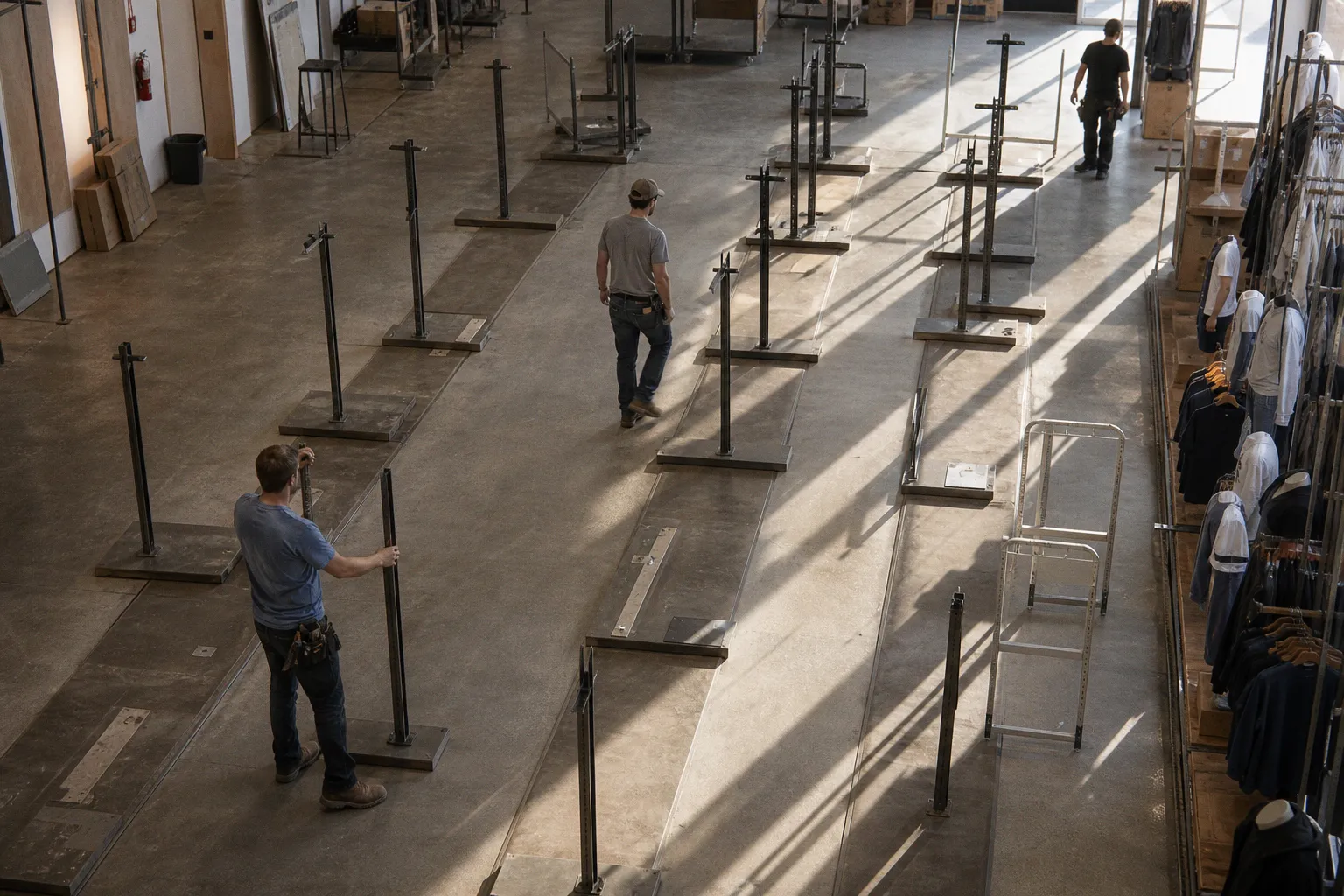
The layout you commit to before the first rack goes up decides whether you capture that conversion — and we've watched too many retailers find out the wrong way. A signed lease, twelve pallets of fixtures in the back, three weeks to opening, and a floor plan that quietly undersells every display it holds.
Compare car rental deals in United Kingdom
See available offersPartner link — DiscoverCars comparisonPick the wrong architecture — grid where you needed free-flow, racetrack where you needed grid — and you'll spend the next year apologizing to customers who can't find anything, employees who can't restock efficiently, and a P&L that keeps leaking margin. So let's walk the floor together and match the layout to the rack strategy that will pay you back.
Maximizing SKU Density with Grid and Loop Architectures
When your business runs on variety — real variety, the kind where shoppers expect 200 yogurt SKUs or every nut and bolt under the sun on display — the grid layout is the workhorse you keep coming back to. Parallel aisles, shelving on both sides, long sightlines that let a customer scan an entire department in one glance. This is the architecture of grocery stores, pharmacies, hardware stores, and any retail format where the buyer walked in with a list and wants to leave with every item checked off.
The beauty of a true grid is SKU density. You're running merchandise down two walls of an aisle at a time, which means every square foot of floor is paying rent twice. In a typical 1,800-square-foot box, a well-planned grid can carry 30–40% more product on the floor than a free-flow arrangement using the same footprint — that's not theory, it's geometry. If your category rewards breadth, if your customer is comparing brands side by side and your margins live on volume, the grid converts that math into dollars.
The honest trade-off, though, is that grids feel transactional. Customers move through them the way they move through an airport: efficiently, but without lingering. If your business model depends on discovery — on a shopper wandering into a category they didn't intend to visit — the grid is going to underperform, because you've essentially built a highway through your store instead of a destination.
That's where the loop — the racetrack — earns its keep. Instead of letting shoppers cut diagonally across your floor, the loop wraps them along a defined perimeter, dragging them past every department whether they planned to visit it or not. Big-box home goods, club stores, and large apparel flagships lean hard on this layout because it trades efficiency for exposure. A customer who walked in for bedding gets a controlled march past cookware, accent rugs, and the seasonal display before they reach the registers. For retailers with broad assortments and high impulse potential, that forced detour is worth more than the few feet of floor you lose to the central spine.
The trade-off, and we've watched this one bite plenty of operators, is that loops need room to breathe. Cram a racetrack into 1,200 square feet and your shoppers feel like they're being herded. Loops sing above 4,000 square feet; below that, the grid almost always wins on pure economics and on the customer experience.
If your shopper came in with a list, give them a grid. If they came in for a feeling, give them a free-flow.
The Boutique Advantage: Free-Flow Layouts for Browsing
Now flip the script. You're opening a 900-square-foot cosmetics boutique, a curated denim shop, or a children's clothing store where the buying experience is supposed to feel like exploring, not executing a list. The free-flow layout is built for this exact job. Fixtures cluster by category or vibe rather than running in rigid parallel lines, and shoppers weave through the space on their own terms, deciding their own path.
What free-flow gives up in SKU density, it returns in dwell time and basket size. When a customer isn't being funneled, they slow down. They pick up the second item, compare the third, and often walk out with something they didn't know they wanted when they walked in. Apparel, beauty, gift, and lifestyle stores live or die on this dynamic, which is why free-flow dominates in boutiques and cosmetics floors under 2,000 square feet. The math works like this: longer dwell means more touches, more touches mean higher conversion, and higher conversion means larger baskets even if the per-square-foot productivity looks lower on paper.
The catch is reconfigurability. A free-flow floor is a living thing — you'll swap fixtures seasonally, rotate feature walls, and rearrange vignettes every four to eight weeks if you're doing it right. That means your racks need to be modular, lightweight enough to move without a contractor, and forgiving of uneven spacing. If your merchandising team can't reset the floor in an afternoon, the free-flow layout becomes a liability rather than an asset. Heavy bolted-in gondolas and fixed built-ins kill the format before it has a chance to breathe.
If your category rewards storytelling — where the customer needs to see the full outfit, the full skincare routine, the full gift set — and your footprint sits under 2,000 square feet, free-flow is almost always the right answer. If your category rewards comparison shopping and your footprint sits above 4,000, you're in racetrack territory.
A Quick Side-by-Side
| Layout | Best For | SKU Density | Customer Behavior | Sweet-Spot Footprint |
|---|---|---|---|---|
| Grid | Grocery, pharmacy, hardware, value retail | Highest | Task-focused, efficient, low dwell | 1,500–6,000 sq ft |
| Loop / Racetrack | Big-box home goods, club, large apparel | Medium-high | Forced exposure, high impulse capture | 4,000+ sq ft |
| Free-Flow | Boutiques, cosmetics, apparel, lifestyle | Lower | Browsing, discovery, high dwell time | Under 2,000 sq ft |
Vertical Merchandising: Turning Walls into High-Yield Sales Zones
Here's the move that quietly separates a floor that converts from one that just occupies space: treat your walls like a vertical department store. In any boutique under 1,500 square feet, walls deliver 35% to 45% of your available linear merchandising space. That's not a fringe number — that's nearly half your selling real estate hanging vertically, and most retailers under-use it.
Wall-mounted systems like slatwall and gridwall let you stack product from 15 inches off the floor — the lower bound of the ADA reach range — all the way up to 84 inches or higher. The sweet spot for customer engagement sits between roughly 30 and 60 inches: that's the band where hands reach without stretching and eyes lock without scanning. Stock the bottom 15 inches with backup inventory or clearance, the 30-to-60 band with your heroes and your highest-margin items, and the upper band with secondary cross-sell and signage. Below 15 inches and you're storing, not selling. Above 72 inches and you're decorating, not converting.
The economics get sharper when you stack them against rent. Ground-floor retail in mid-tier US markets runs $40 to $200 per square foot annually. Every linear foot of wall you activate is essentially buying back floor square footage at a fraction of the lease cost. A 30-foot slatwall run, properly merchandised with cross-sell adjacencies, can outperform a four-way rack sitting in the middle of an aisle — and it doesn't eat up customer circulation space or trigger ADA turning-radius requirements.
If you're working a free-flow boutique layout, this is where you build your perimeter story: feature wall at the entrance for the seasonal hero, secondary walls broken into category vignettes, and the back wall reserved for the highest-margin impulse items. In a grid store, walls become the destination for oversized goods, end-of-aisle promotions, and the cross-merchandising pairings that move slow inventory alongside fast movers. In a loop, the wall behind the perimeter run becomes your storytelling real estate — the place where the customer pauses mid-circuit to read, compare, and decide.
ADA Compliance and the Economics of Aisle Width
Let's talk about the constraint that decides whether your beautiful layout actually ships: ADA-compliant aisle widths. The federal standard requires a minimum 36 inches of clear width on any accessible route. That's your floor — anything narrower and you're out of compliance, full stop.
But here's the wrinkle most floor plans don't surface early enough. If your aisle narrows below 60 inches at any point — say, between a gondola end and a wall, or through a feature display — you need a 60-by-60-inch passing space at least every 200 linear feet. That turning radius eats floor, and in a tight boutique it can knock 8–12% off your merchandising footprint. The math is unforgiving: a 1,000-square-foot store that loses 10% of selling space to ADA pockets is functionally running a 900-square-foot operation at full-rent prices.
The honest version: widening aisles to meet ADA standards is not always easy, and it's not always free. Giving up 12% of selling space to meet code can feel like handing the landlord a discount you didn't budget for, especially in a format where every linear foot is supposed to be paying back. The smart play is to design the compliance into your planogram from day one, not retrofit it after the contractor walks the floor with a tape measure. Run your main arteries at 42–48 inches, your secondary aisles at 36 inches, and stage every fixture so the 60-by-60 turning pockets land at natural intersections — not in the middle of a power wall where they disrupt sightlines and break up category flow.
Reach range matters just as much. ADA guidelines place the accessible customer reach between 15 and 48 inches from the floor. Your best-selling product, your highest-margin items, your impulse triggers — all of them should land inside that band. Stocking premium product above 72 inches is essentially paying rent for storage with a price tag on it. Too often, high-margin merchandise ends up above the accessible reach range: visible, technically displayed, and still effectively out of the customer's hands. That's not merchandising. That's inventory hiding.
Strategic Placement: Capturing the 40% Impulse Opportunity
Now we get to the number that should keep every retail floor manager up at night: impulse purchases account for up to 40% of all retail sales, and roughly 80% of those happen inside a physical store. Translation — your layout is where the bulk of in-store impulse conversion gets decided, working alongside pricing, promotion, and the sensory cues your fixtures put in front of the shopper.
Three zones do almost all the heavy lifting. The checkout zone captures more than 65% of in-store impulse purchases, which is why the gum, the lip balm, the $8 impulse item live there and not in the back corner. The end-cap — that free-standing display at the end of an aisle — gets noticed 100% of the time. Not 70%, not "frequently." Every customer walking that aisle sees it. And the front-of-store feature zone, the first 15 feet past your entrance, captures the buyer who hasn't yet committed to a path.
If you're working a grid layout, your impulse strategy should stack these three zones in sequence: front feature, end-caps every 30–40 linear feet, and a layered checkout zone that fronts multiple sides of the register. In a free-flow boutique, the math shifts — your checkout is one fixture, your end-caps are the corners of your customer path, and your feature zones are the visual breaks that pull a shopper deeper into the floor. In a loop, the impulse zones ride the perimeter, spaced roughly every 60 feet so the customer hits a trigger before they've completed the circuit, with the checkout as the final punctuation.
If your layout is producing the foot traffic but the register is still underperforming the category benchmark, the diagnosis almost always lives in those three zones, not in the middle of the floor where you've spent most of your merchandising budget.
End-caps get noticed 100% of the time. If yours aren't pulling their weight, the layout isn't the problem — the merchandising is.
Closing — The Floor Plan Verdict
Here's where we land, and where we'd put our name on the planogram. No single layout is universally superior — the right answer depends on store size, product range, and the customer behavior your category rewards. But the matching logic is unforgiving: a 1,200-square-foot cosmetics boutique on a racetrack will hemorrhage the dwell time it needs to sell fragrance. A 6,000-square-foot hardware store in free-flow will sacrifice the SKU density that justifies its lease. A 3,000-square-foot apparel store that tries to be both grid and free-flow ends up being neither.
Match the floor plan to the buying mission, then build your rack strategy inside that frame. If the mission is "get the shopper in and out with everything on the list," go grid and load the walls and end-caps. If the mission is "let the shopper wander and discover," go free-flow and make every fixture modular. If the mission is "force exposure to the full assortment," go loop and let the perimeter do the work.
Three numbers worth writing on the planogram before you order fixtures: 36 inches as your non-negotiable aisle floor, 48 inches as your highest-conversion reach ceiling, and a checkout zone wide enough to carry three facings of $8 impulse merchandise on every side. If you hit those marks, the layout stops being a guess and starts being a sales instrument.
Walk the floor with a tape measure before you sign the fixture order. That's the cheapest due diligence you'll ever do, and it's the one step that separates the retailers who scale from the ones who keep apologizing for the dead zones they built into their own blueprint.