Round rack color blocking: when does it actually work?
Walk into any trade show or scroll through a merchandising supplier's catalog, and you'll see the same seductive image: a round rack draped in a perfect ombre of garments, colors bleeding into each other like a sunset over a fabric ocean.
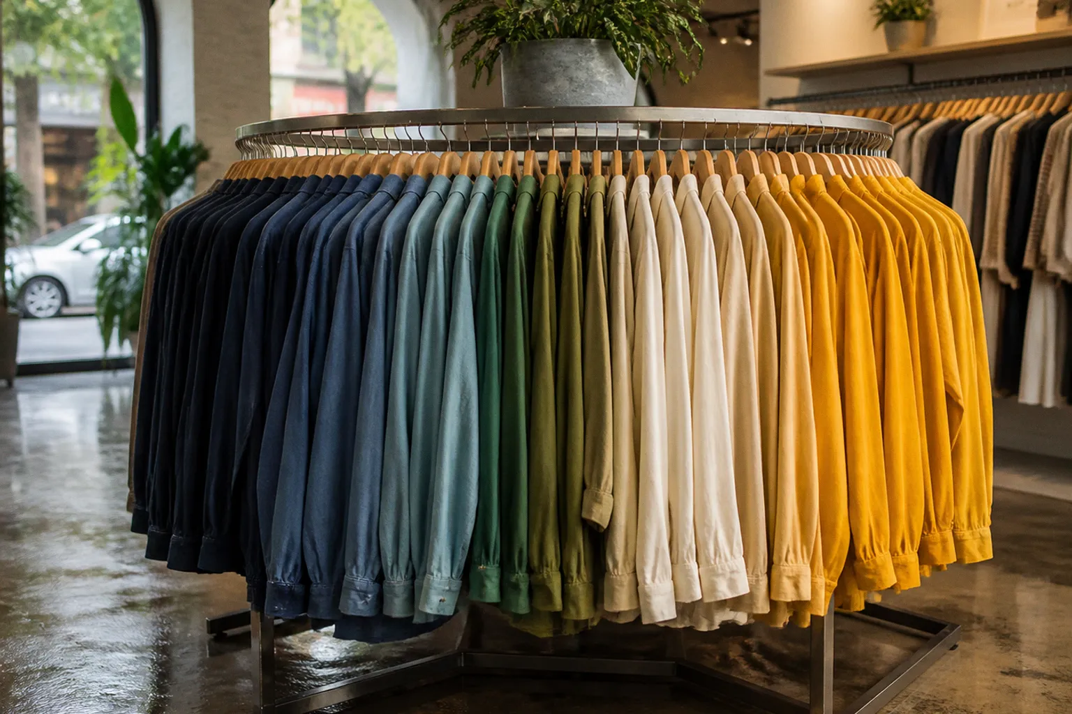
The pitch is always the same — "color blocking drives impulse purchases," "organized displays increase dwell time," "your rack becomes a destination." Sounds great. I've also heard that a gym membership makes you fit.
Here's the thing nobody selling you that vision mentions: a round rack is a 360-degree problem. It has no clear left-to-right reading direction like a wall display. It spins. Customers approach it from unpredictable angles. And the moment you prioritize a pretty gradient over actual shopability, you've built a sculpture, not a selling tool. I've installed enough of these fixtures to know that the gap between "looks amazing in a photo" and "works on a Saturday afternoon with twelve customers circling it" is enormous.
So let's cut through the color-blocking gospel and figure out when it genuinely earns its keep on a round rack — and when it's just decorative busywork.
The Psychology Isn't Wrong — But It's Not a Blank Check
Colors account for the majority of first impressions in retail environments. That's not marketing fluff; it's consistently observed across merchandising research. A rack that reads as chaotic — random hues jumbled together — signals disorganization to a shopper's brain before they even touch a garment. A rack that reads as intentional, with clear color grouping, lowers the cognitive effort of browsing. Less friction, more engagement. That part of the pitch is real.
But here's where I get skeptical. The leap from "color influences perception" to "therefore, rainbow-sequence your round rack" skips about three critical steps. First, the type of merchandise matters enormously. A rack of solid-color basics — plain tees, crewneck sweaters, uniform leggings — is a legitimate candidate for color-first organization. A rack of patterned blouses, mixed-fabric jackets, or seasonal outerwear? Color blocking becomes a visual mess because the patterns fight the gradient. You end up with a rack that looks organized from ten feet away and confusing up close.
Second, your floor layout determines whether a color-blocked round rack even registers. If it's tucked in a corner behind a gondola endcap, no amount of chromatic choreography will save it. The rack needs sightlines — a clear approach path where the color story can unfold as the customer walks toward it. Without that spatial context, you're optimizing the wrong variable.
A round rack with perfect color blocking and no sightline is a painting in a dark room.
Seasonal Gradients: The One Rule That Actually Has Legs
If there's a single color-blocking convention I've seen hold up across different store formats, it's the seasonal directional rule. During winter, dark-colored garments anchor the left side of a hanging display, transitioning toward brighter and lighter colors on the right. In summer, the direction flips — lighter or brighter colors sit to the left, moving toward deeper tones on the right.
Why does this work? Because it mirrors how shoppers unconsciously process seasonal palettes. Winter browsing starts with expectation: charcoal, navy, deep burgundy. The eye lands on the anchor (dark, left) and sweeps right, where the display rewards attention with lighter, more surprising picks — a cream knit, a dusty rose scarf. Summer reverses the emotional arc: you enter with lightness and build toward richer tones.
On a round rack, applying this means you pick an entry point — the angle most customers will approach from — and treat that as your "left." You build the gradient clockwise or counterclockwise from there. It's not a 360-degree rainbow; it's a directional story with a deliberate starting position. The rest of the rack supports the gradient but doesn't need to be a perfect continuum.
This is the one rule I'd actually defend. It's grounded in how people scan, it adapts to seasons, and it doesn't require your entire inventory to be solid-color basics.
The VIBGYOR Hack for Nearly Identical Tints
Here's a scenario I run into constantly: a retailer has a rack of garments that are all in the same color family — say, twenty variations of blue, from near-navy to powder. Or a wall of earth tones that range from espresso to sand. The differences are real but subtle. Laid out randomly, the rack looks like a mistake — like someone dumped a laundry basket.
This is where the reverse rainbow sequence — VIBGYOR (Violet, Indigo, Blue, Green, Yellow, Orange, Red) — applied from left to right becomes genuinely useful. On a round rack, you translate "left to right" into a clockwise progression around the fixture. The darkest or most saturated tint sits at your chosen entry point, and the lightest or least saturated sits roughly 270 degrees around.
The trick is that VIBGYOR isn't about putting a violet shirt next to an orange one. It's about using the sequence's internal logic to order tints within a narrow band. If everything on the rack is blue, you're really using the principle to go from deep blue to blue-green to blue-violet in a way that feels intentional rather than arbitrary. The sequence gives you a spine to hang the arrangement on.
Does it work every time? No. If the tint variation is genuinely minimal — we're talking about differences you can only see in direct daylight — then no amount of VIBGYOR logic will make the rack read as organized. At that point, you're better off grouping by garment type or size and accepting that color isn't your primary organizing axis.
Complementary vs. Analogous: Choosing Your Contrast Strategy
This is where color theory gets practical and where most generic merchandising advice falls apart. You have two legitimate strategies for pairing color groups on a round rack, and they serve completely different purposes.
Complementary colors sit opposite each other on the color wheel — think blue and orange, purple and yellow. When placed side by side on a display fixture, they create maximum visual contrast. The eye snaps between them. This is high-energy, high-attention merchandising. It works when you want a rack to function as a focal point — a seasonal feature display near the entrance, a promotional endcap, a window-adjacent statement piece.
Analogous colors sit next to each other on the wheel — blue, blue-green, green, for example. They create a harmonious blend, a smooth visual flow with no hard edges. This is calm, browsing-friendly merchandising. It works when the rack is meant for sustained exploration — a mid-floor basics display, a department transition zone, a space where you want customers to linger without visual jarring.
Here's the decision framework I use:
| Scenario | Strategy | Why It Works |
|---|---|---|
| Entrance feature rack, new arrivals | Complementary pairs | Maximum visual pop to pull foot traffic |
| Mid-floor basics wall, everyday stock | Analogous gradient | Low friction, encourages extended browsing |
| Seasonal clearance display | Complementary with high saturation | Urgency signal — bold contrast reads as "event" |
| Fitting room adjacent, upsell rack | Analogous, muted tones | Calm palette reduces decision fatigue |
| Window display, editorial styling | Either, depending on brand story | Context dictates energy level |
The mistake I see constantly is defaulting to complementary pairing everywhere because it "pops." It pops, sure. It also exhausts. A store where every rack screams for attention is a store where nothing gets attention. Contrast is a tool, not a default setting.
The Navigation Problem Nobody Talks About
Here's the uncomfortable truth that the color-blocking evangelists tend to skip: while rainbow-ordered clothing displays attract shopper attention, some customers find it difficult to locate specific items unless products are also organized by category or size.
Read that again. The very technique that draws eyes to the rack can actively prevent the sale.
I've watched it happen in real time. A customer walks up to a beautifully color-blocked round rack, admires it for three seconds, then asks a staff member, "Do you have this in medium?" The staff member now has to mentally reverse-engineer the color gradient to figure out where medium might be hiding in the blue-to-green transition zone. If the rack is organized purely by color, size information is scattered across the entire fixture. The customer came in wanting a medium navy sweater. They left with nothing because the sweater was buried in a chromatic story instead of a size cluster.
This is the trade-off you have to manage honestly:
- Color-first organization maximizes visual appeal and impulse discovery. Customers who didn't know what they wanted find things they like.
- Category/size-first organization maximizes conversion for customers who know exactly what they need.
- Hybrid organization — color blocking within size or category clusters — is the compromise that most high-traffic retail environments actually need.
The round rack's geometry makes this harder than on a straight arm or wall bay. You can't just do "small on the left, large on the right" because there is no left and right. You have to think in zones — quadrants or thirds around the circumference — and assign each zone a dual purpose. Top quadrant: color story. Within that quadrant: size progression. It's more labor-intensive to set up and maintain, but it respects both the visual and the navigational needs of the fixture.
Color blocking sells the rack. Size and category blocking sell the garment. You need both.
When to Skip Color Blocking Entirely
I'll be direct: there are round rack situations where color blocking is the wrong call, and pretending otherwise does retailers a disservice.
High-turnover clearance racks. When stock changes daily, maintaining a color gradient is a labor sink that nobody will sustain. Organize by size, mark it clearly, move on.
Mixed-category racks. If a round rack holds jackets, scarves, and bags together (common in lifestyle boutiques), color blocking across product types creates visual confusion. A red scarf next to a red jacket next to a red bag sounds cohesive; in practice, the customer can't parse what's what.
Small-footprint racks with fewer than eight garments. Color blocking needs critical mass to read as intentional. On a petite four-arm rack with two garments per arm, you don't have enough items to build a gradient. Just group by type or occasion.
Stores with inconsistent restocking. If your team can't commit to maintaining the color sequence through replenishment — and in most independent retail environments, they can't — the display will degrade within 48 hours into exactly the random chaos you were trying to avoid. A messy color-blocked rack looks worse than a rack that was never color-blocked at all.
The Reality Check Before You Commit
Before you invest time in color-blocking a round rack, run through these:
1. What's the rack's primary job? If it's a focal point or feature display, color blocking earns its keep. If it's a utilitarian stock fixture, organize for access, not aesthetics.
2. Can your team maintain it? Color sequences break the moment someone restocks without thinking. If replenishment discipline isn't in your store's DNA, don't start a system that requires it.
3. Is the merchandise suited to it? Solid colors and minimal patterns — yes. Heavy prints, mixed textures, varied garment types — probably not.
4. What's the approach angle? Identify where customers will see the rack first and build your gradient from that entry point. A 360-degree rainbow is a fantasy; a directional color story is a strategy.
5. Have you solved for size and category? Color blocking without a secondary organizational axis is a visual trick that sacrifices shopability. Build the hybrid.
Round rack color blocking isn't a myth. It's also not a universal solution. It's a technique with specific conditions, real trade-offs, and a shelf life measured in how disciplined your team is about maintaining it. Use it where the geometry, the merchandise, and the labor model support it. Skip it where they don't. And the next time a fixture supplier shows you a photo of a perfect ombre rack and tells you it'll "transform your space," ask them who maintains it on a Tuesday afternoon when three customers have already spun it around twice.