Retail store layouts: matching pathing options to your shop
The most expensive square metres in a retail store are usually the ones management doesn't notice. A perfectly merchandised display on the left wall of a boutique - good lighting, slow-turning items pitched just so - and almost nobody stops to look at it.
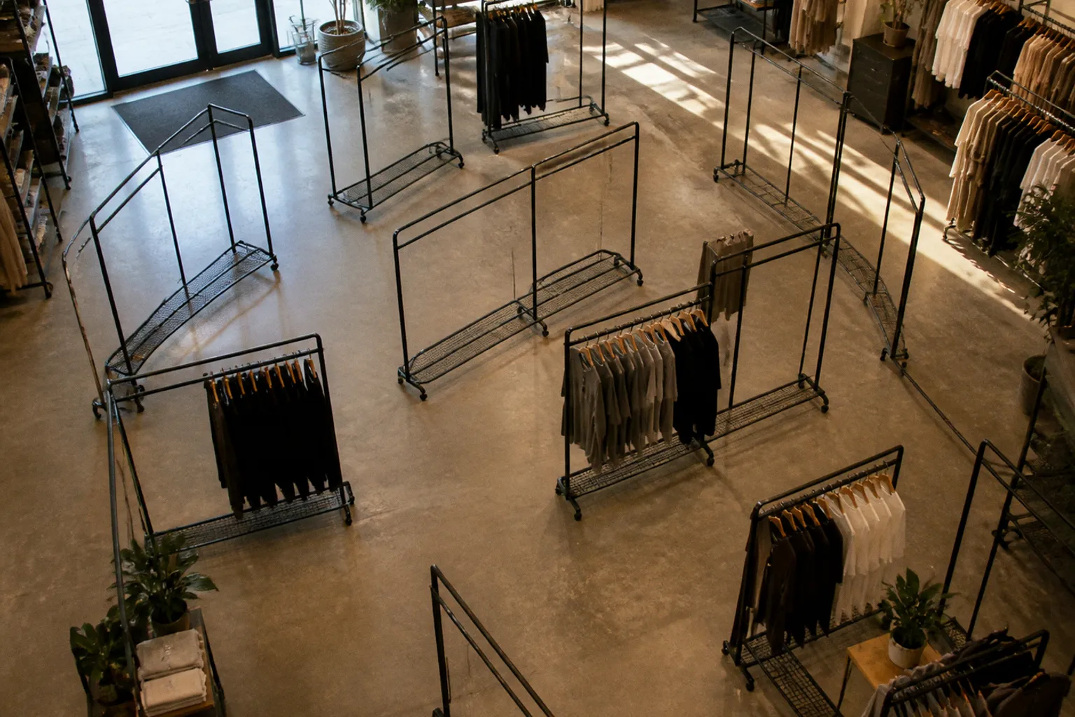
Meanwhile, a smaller fixture on the right is doing three times the volume. Same store, same staff, same SKU mix. The difference is pathing. Choosing a retail store layout configuration isn't a design preference; it's a customer-pathing decision that quietly decides which SKU gets a look, which fixture earns a dwell, and which endcap actually converts.
Most store teams we work with treat floor plan selection as a one-time call made before the first fixture goes in. We treat it as a pathing instrument - and once you read it that way, every grid line, every loop curve, every free-flow sightline becomes a tool for moving baskets through the right sequence of displays at the right pace. This guide compares the three layout archetypes - grid, loop/racetrack and free-flow - against the pathing outcomes they produce, so you can pick the configuration that matches your category mix, your SKU count and your customer's actual walking habits rather than the one your interior designer prefers.
The first five metres: decompression zone and the right-hand rule
Before we get into layouts, we have to talk about the entrance. The first 1.5 to 4.5 metres - roughly 5 to 15 feet - past your door is what we call the decompression zone. It's the strip of floor where a shopper hasn't yet committed to browsing. Industry research on shopper sightlines describes this as a transition window: visitors in this stretch are scanning the room, adjusting from outdoor light to your lighting, dropping their street-side mindset. They don't process product the way they will ten seconds later, which is why dropping a hero display into this stretch is one of the most expensive merchandising mistakes we see on the floor.
What they do instead is turn. Retail traffic analysts, including work carried out across multiple industry flow studies, point to a strong behavioural default: roughly 90 percent of store visitors, given a choice, will turn right when they cross the threshold, then proceed counterclockwise around the perimeter. We won't pretend this is a law of physics - it's a default that holds robustly in right-driving markets and gets blurrier in left-driving ones, which is a caveat we always flag in the introduction. But in the standard North American or continental European store, the pathing math is the same: if your entrance pushes customers right and they read counterclockwise, the wall immediately past the decompression zone is your most valuable real estate. We call it the Power Wall, and that's where your highest-margin, most conversion-ready product lives - not behind the welcome desk, not beside the queue pole, not under the promotional banner.
If your entrance funnel allows a choice, customer traffic will look for the right turn about nine times out of ten. Plan your hero display accordingly.
Practical consequence for the layout conversation: any pathing plan you build has to start at the door. The layout archetype you choose is downstream of that initial right-hand bias, because it either amplifies it, neutralises it, or fights it. A grid plan fights it. A loop plan amplifies it. A free-flow plan mostly lets it happen on its own.
Three layout archetypes, three different jobs
There are essentially three pathing configurations that cover the vast majority of small-to-mid-size retail floors - and we'd argue the vast majority of large ones too, once you understand what each one is really for.
Grid layout: maximum SKU density, minimum romance
The grid is the grocery-store archetype: parallel aisles set at right angles, fixtures long enough to display dozens of SKUs per run, traffic forced into predictable lanes. It's the layout we reach for when the product is high-volume, repeat-purchase, and the customer's primary job is to locate a specific item quickly and leave.
Why we use it: a grid maximises display density per square metre, which is exactly what you want when you carry thousands of SKUs of fast-moving goods. Sightlines are predictable, planogram resets are fast, and endcaps at every aisle head can be programmed on a four- to six-week cycle to do real category work. The pathing trade-off is that shoppers in a grid don't browse the way they do in a boutique. They transact. If your category mix leans experiential - apparel, gift, beauty discovery, anything where shoppers need a slow walk to convert - the grid will undersell the merchandise every time.
Loop (racetrack) layout: a forced journey past every category
The loop is a deliberate circular path that pulls the shopper along the perimeter of the store and past every major department before returning them toward the till. Department stores, big-box home goods and most flagship apparel footprints use it because it converts browsing into exposure.
Why we use it: if you sell across multiple categories and need every visitor to see the lighting, the throw pillows, the rug display and the candles before they reach checkout, the loop is the cleanest way to guarantee that exposure. It's also a strong layout for dwell time - we typically see loop stores maintain visits in the seven-to-ten-minute range that shopper studies tend to flag for standard retail. The trade-off: a poorly drawn loop is a one-way funnel that frustrates repeat customers who already know what they came for, and it produces dead zones in the centre of the floor that have to be merchandised twice as hard as the perimeter.
Free-flow layout: the boutique default, the discovery engine
The free-flow plan drops the rigid structural aisles. Fixtures are freestanding, plinths float, sightlines are intentionally long and gently broken. We see it most often in fashion boutiques, concept stores, beauty halls and luxury flagships - anywhere the act of browsing is itself part of the value proposition.
Why we use it: free-flow rewards dwell. It's the layout that lets a customer stumble on an unexpected pairing, slow down at a styled mannequin vignette, and convert on something they didn't plan to buy. Pathing is loose, which means merchandising has to do the heavy lifting - every fixture has to earn its position because the customer can route around anything that doesn't pull them in. The trade-off: you can't run a free-flow with a SKU count that demands a grid. Trying to force a multi-thousand-SKU grocery assortment through a free-flow plan produces a fake-aisle floor that loses the benefits of both layouts.
The three configurations at a glance
| Parameter | Grid | Loop / Racetrack | Free-flow |
|---|---|---|---|
| Best SKU profile | High (1,000+ SKUs) | Medium (200–1,000) | Low to medium (under ~600) |
| Common retail use | Grocery, pharmacy, hardware | Department, big-box apparel, home goods | Boutique, beauty, luxury, concept |
| Customer pathing | Linear, transactional | Forced perimeter, sequential | Loose, discovery-led |
| Dwell-time range | Short, mission-driven | Medium (roughly 7–10 min) | Long, experiential |
| Sightlines | Short, predictable | Medium, controlled | Long, intentionally broken |
| Endcap power | Very high | Medium (curve hot spots) | Low (every fixture competes) |
| Conversion strength | Planned purchases | Cross-category exposure | Impulse and add-on basket |
| Planogram complexity | High, rigid | Medium | Low, continuous re-merch |
| Risk if misapplied | Feels clinical, kills browsing | Feels forced, frustrates returners | Feels chaotic, buries hero product |
The table is a starting line, not the finish line. In actual store audits we see plenty of footprints under 200 square metres running a clean hybrid: a grid skeleton in the back-of-house zone and a free-flow curve at the front, because the pathing math changes the moment the customer has crossed the decompression zone and made their first turn.
Inside the chosen path: where racks do the real work
Picking the layout is the headline decision. Inside the layout is where the conversion lives, and the choices you make between your three rack formats matter as much as the floor plan itself.
For grid footprints, we push most clients toward gondola runs of 1.2 to 1.8 metres with consistent 1.0- to 1.1-metre aisle spacing. That spacing is a working compromise: wide enough that two carts can pass with comfort, narrow enough that you keep sightlines broken and product density high. Endcaps at every aisle head, rotated on a four- to six-week planogram cycle, are pulling more of the category conversion than the runs they sit on - in our floor-reads the endcap is almost always the highest-yielding fixture in a grid layout, and a stale endcap is the fastest way to lose that yield.
In a loop layout, the pathing geometry puts the prime real estate on the outside curve. That's where you want high-engagement fixtures - styled mannequins, large-format display tables, signage that reads from across the floor. The inner curve gets secondary merchandising and quiet utility fixtures. The centre of a loop store is where pathing happens to die, so we usually turn that centre into a deliberate destination: a service desk, a seated fitting area, a feature wall. Filling the loop centre with endcap-style racks is one of the most common merchandising errors we walk into, because it competes with the perimeter path the customer is already on.
Free-flow layouts are where the rack choice itself does the heavy lifting. We tend to mix heights aggressively - a 1.5-metre-tall fixture next to a 1.1-metre display table creates the broken sightlines that pull a customer off the perimeter and into the middle of the floor. Mannequin vignettes and styled plinths are not decoration in a free-flow; they are the path. Every fixture in the room should be answerable to the question: what does this cause the customer to stop and do?
Every rack in a free-flow plan has to earn its position. The customer can route around anything that doesn't pull.
Pathing KPIs that tell you if the layout is working
Layout decisions that aren't anchored to a number tend to drift. We always close planning conversations by handing the customer two metrics to track over the first 30 to 60 days after a refit.
The first is dwell time. Standard retail visits in most categories land in the seven-to-ten-minute range that research tends to flag; if your store is running closer to four, the layout is signalling that customers can't find anything to engage with, and free-flow or loop moves are probably overdue. If dwell is running past 15 minutes on a high-volume grid site, the layout is underserving the transactional shopper, and there's an opportunity to clean up sightlines and tighten the path.
The second is the pathing-to-conversion ratio. Modern people-counting and POS analytics can show you which fixtures a converting customer touched and which aisles they walked past. If 20 percent of your floor is carrying most of the basket weight, the layout is doing its job. If the bottom half of the floor is barely registering touches, you have dead zones - and we'd rather see you rework those zones with a different fixture mix than accept them as inevitable.
Industry analyses broadly suggest that well-tuned pathing and layout work can move retail revenue by 20 to 40 percent depending on the starting point. We treat that range as directional rather than guaranteed: a store with no pathing discipline will land near the top of the range; a store that already has a tuned layout will see a much smaller move. But the principle holds - the floor plan is, in our experience, the single largest lever a retailer pulls short of the merchandise itself.
What to watch out for when you implement
Three things get glossed over in most layout plans, and we want to be straightforward about each of them.
First, the right-turn default. The 90-percent figure is well-supported in right-driving markets, but it softens in left-driving contexts - the UK, Ireland, Australia, parts of Asia - where behaviour analysts have flagged mixed evidence. If you're fitting out a left-driving store, don't assume the Power Wall sits on your right without testing. Sometimes it does, sometimes it ends up on the left, and sometimes the customer just heads straight for the category they came in for and the rule barely applies. This is one of the genuine unknowns in the pathing literature, and we say so plainly rather than pretend the rule travels cleanly across every market.
Second, the layout is not the same thing as the experience. A technically correct grid store can still feel sterile, and a beautiful free-flow can still feel empty. What converts is the intersection of path, fixture, lighting and the small choices at the shelf - category adjacency, sightline breaks, signage at the right scale. The layout sets the stage; the merchandising on it is the play.
Third, there is no universal conversion lift that can be attached to any one rack type across all boutique categories. The endcap patterns we flagged earlier are working figures from grocery and mass audits, not constants you'll see in a fifty-square-metre boutique. Plan to measure your own numbers before you let any vendor's "average" set your expectations for the floor.
A short pathing checklist before you commit
Before you finalise a layout against your floor, run through this with your team:
- Confirm the decompression zone is merchandised gently - hero product goes past it, not into it.
- Identify the Power Wall on your floor and put hero merchandise there, even if it costs you a prime fixture elsewhere.
- Match the layout to SKU count first; match the layout to aesthetic second.
- Decide which wall is your slow-turning wall and design the path away from it, not toward it.
- Set a dwell-time target and a pathing-to-conversion target for the first 60 days.
- Audit endcap rotation on a four- to six-week planogram cadence; stagnant endcaps pull a grid down fast.
- Re-walk the floor with a stopwatch once a month, customer-side, and reset what doesn't work.
The floor is the brief
We're biased on this point, but after enough store audits we think the layout conversation matters more than the lighting conversation, the signage conversation, or the colour conversation - and we say that as people who love all three. The floor plan is the customer's first contract with your store. They either sign it by turning right and following the path you built, or they don't sign it and walk straight back out. Pick the layout that matches your category, respect what the entrance is already telling you about how shoppers move, and treat every fixture as a pathing decision rather than a furniture decision. The retail math works out the rest of the way.