Apparel Rack Merchandising: Vertical vs Horizontal
A rack can be fully stocked and still underperform. The problem is often not the assortment, the price, or even the location—it is the way the customer has to read the fixture.
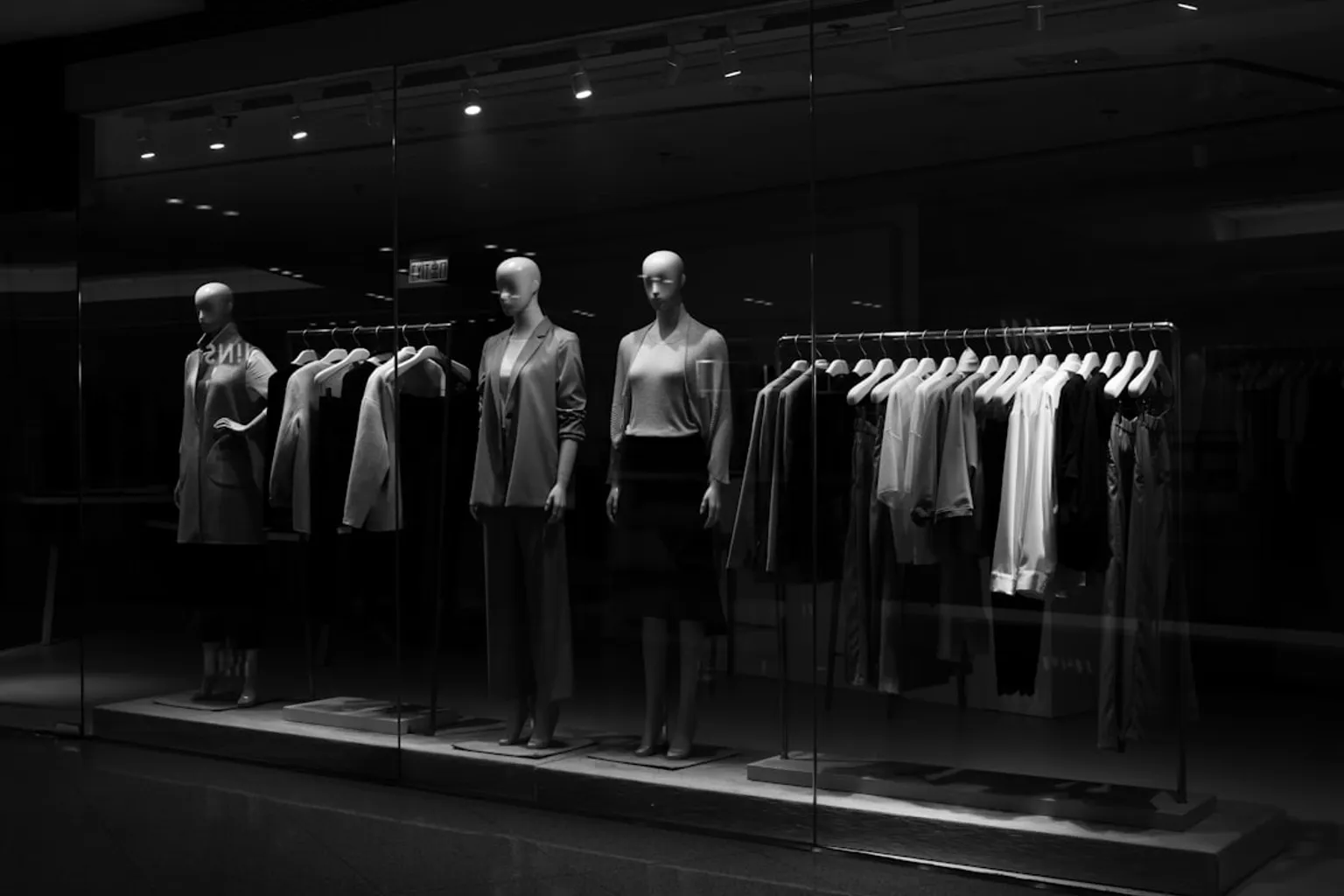
When products are arranged horizontally, shoppers move along the rack to see the complete range. When they are arranged vertically, a customer can scan a product story from top to bottom in one sightline: jacket, shirt, trouser, accessory, and sometimes footwear. That difference changes dwell time, product comprehension, and the likelihood of a complete outfit purchase.
Compare car rental deals in United Kingdom
See available offersPartner link — DiscoverCars comparisonThe practical question is not whether vertical or horizontal merchandising is “better.” It is where each layout earns its space, how it affects customer pathing, and whether your apparel rack is being asked to sell variety, build an outfit, target a demographic, or create a visual focal point.
The psychology of sight: why horizontal processing still matters
Human vision is naturally organized across a horizontal field. We read, scan, and compare from left to right, which makes horizontal merchandising useful when the customer needs to evaluate a broad range of similar products.
Think about a denim wall, a T-shirt run, or a rail carrying one dress in multiple colors. The shopper is not necessarily looking for a complete story. They are comparing washes, silhouettes, prints, or price points. A horizontal arrangement lets the assortment unfold in sequence as the customer walks past the rack.
That movement is not automatically a weakness. If the goal is to increase browsing time or expose the shopper to a larger range, horizontal merchandising can extend the customer’s path through the department. The rack becomes a linear edit: one product family follows another, and the customer discovers the range by moving from left to right.
Horizontal merchandising is particularly effective when:
- The assortment is deep and customers expect to compare options.
- The product category is easy to understand without an outfit context.
- You want to separate demographics on one fixture.
- The rack sits in a high-traffic aisle where shoppers naturally move parallel to it.
- Color, size, or price progression is more important than cross-selling.
- The product requires physical inspection, such as fabric touch, stretch testing, or label comparison.
A practical example is a women’s knitwear rack with the same cardigan offered in cream, gray, navy, and black. Place the colors side by side, keep the size sequence consistent within each color, and the customer immediately understands the range. The visual message is breadth.
The trade-off is visibility. A shopper standing at one point on the aisle sees only part of the assortment. If the strongest color or highest-margin item sits several feet away, it may never enter the first sightline. Horizontal layouts therefore need stronger endcaps, signage, and sightline control than vertical layouts.
Horizontal merchandising sells the range by making the customer travel through it; vertical merchandising sells the relationship between products by making the story visible in one glance.
This is why horizontal blocking works well in a department where variety is the commercial proposition. It is also why it can fail when the customer needs help understanding what belongs together.
Vertical ribboning: turning a fixture into an outfit builder
Vertical merchandising arranges products in columns, or “ribbons,” from top to bottom. On an apparel rack, that may mean placing related products at different heights so the customer sees a complete outfitting logic without walking along the entire fixture.
A vertical product placement retail strategy might look like this:
- Tops or blouses on the upper level.
- Jackets, overshirts, or structured layers in the middle.
- Trousers or jeans below.
- Handbags, belts, or footwear at the lowest visual tier.
The point is not to stack random products upward. The point is to create a vertical relationship that answers the shopper’s next question before they ask it: “What goes with this?”
This makes vertical merchandising powerful for outfit-led categories, seasonal stories, and collections where the average transaction value depends on multiple-item purchases. A customer who came in for a blazer may notice the coordinating trouser below it, then see a blouse or belt completing the look. The fixture carries more selling responsibility because it communicates both the hero item and its supporting products.
Vertical layouts are also useful when the store has limited floor space but a meaningful assortment to present. Instead of dedicating separate horizontal runs to every product category, you can use height to create a compact outfitting zone. That is especially effective on four-way racks, wall bays, and modular display systems with adjustable arms.
However, vertical merchandising demands discipline. If too many categories are stacked into one column, the fixture becomes visually noisy. The customer sees activity rather than a clear commercial message. We want the eye to move down the ribbon naturally, not stop at a pile of unrelated SKUs.
Use vertical ribboning when:
1. The product has a natural companion. A dress can be paired with a cardigan, a suit with a shirt, or denim with a coordinated top.
2. The collection has a strong seasonal or lifestyle story. Resort, workwear, occasion dressing, and back-to-school edits benefit from vertical storytelling.
3. You need to increase outfit conversion. Place the most commercially important companion within the same sightline as the hero product.
4. The fixture is located at a focal point. A vertical arrangement works harder when it sits at the end of a sightline or near the first right-hand turn.
5. The shopper must understand the collection quickly. Vertical layouts reduce the need to walk the full rack before the assortment makes sense.
The strongest vertical displays usually have one dominant product family and two or three supporting layers. The objective is not maximum SKU density. It is maximum comprehension per square foot.
Vertical vs horizontal merchandising on apparel racks
The decision becomes easier when we stop treating the two methods as competing visual ideologies and instead assign each one a job.
| Merchandising objective | Vertical ribboning | Horizontal blocking |
|---|---|---|
| Build complete outfits | Strong; related categories can be stacked in one sightline | Moderate; products may be separated along the rack |
| Show color variety | Effective when colors form clean vertical ribbons | Strong when colors are grouped side by side |
| Encourage comparison | Less efficient if shoppers need to scan many similar SKUs | Strong; the assortment unfolds naturally left to right |
| Maximize first-glance comprehension | Strong; the customer can read the outfit from top to bottom | Depends on position; only part of the range may be visible |
| Support cross-merchandising | Strong; tops, layers, bottoms, and accessories can connect | Moderate; requires careful adjacency across the run |
| Target different shopper groups | Useful when categories are stacked by need or use | Strong when adult, youth, premium, and value ranges occupy separate zones |
| Work with high SKU depth | Can become cluttered if too many ribbons compete | Stronger for broad, comparable assortments |
| Support a focal point or endcap | Strong; creates a clear vertical visual anchor | Effective for brand or color blocks, but can require more viewing distance |
| Encourage aisle movement | Limited; the story can be understood from one position | Strong; customers travel along the fixture to see the range |
| Communicate a lifestyle edit | Strong; outfit logic is immediately visible | Moderate; requires stronger signage and product grouping |
This table gives us the commercial distinction: vertical is usually a relationship tool, while horizontal is usually a comparison tool.
That does not mean the entire store should use one method. In a well-merchandised apparel department, the two layouts work together. A horizontal run may present all available denim washes, while a vertical focal fixture shows one complete denim outfit. A horizontal knitwear rail can hold the full color range, while a vertical endcap presents the season’s preferred styling.
The best arrangement depends on what the shopper needs to do next.
If the customer needs to compare, give the assortment room to unfold horizontally. If the customer needs inspiration, make the outfit visible vertically. If the store needs both, use a hybrid sequence: horizontal blocking for depth, vertical ribboning for the hero story.
Mastering the prime zone: eye level, sightlines, and traffic flow
No rack layout performs independently of its height. The same vertical arrangement can be highly effective on one fixture and invisible on another because the hero product has landed outside the shopper’s natural viewing zone.
For adult shoppers, the prime eye-level zone is commonly placed between approximately 1500 mm and 1700 mm. This is where the most commercially important product, strongest color, or clearest message should generally appear. It is not a universal rack-height mandate—fixture dimensions vary by brand, garment type, accessibility requirements, and store concept—but it is a useful planning range for the most visible portion of the display.
On a vertical rack, the eye-level zone should carry the anchor. If the upper level contains a lightweight blouse, the middle level holds a jacket, and the lower level contains denim, decide which of those products is meant to stop the customer. The jacket may have the highest margin, the blouse may be the seasonal launch, or the denim may be the traffic driver. The eye-level position should reflect that commercial priority rather than being assigned simply because the garment fits there.
On a horizontal rack, eye level determines which part of the sequence gets seen first. If the rail begins with basic black T-shirts at the customer’s natural entry point but the new collection sits at the far end, the fixture is making the customer work too hard. The strongest product should meet the shopper in the first high-visibility section, especially when the rack is positioned near a store entrance or department transition.
Traffic flow changes the answer again. A large proportion of shoppers turn right after entering a store, so the first right-hand sightline deserves deliberate treatment. Place a vertical focal point, a strong color ribbon, or a concise seasonal story at the end of that sightline—not a random clearance fixture or an overfilled rack. That first visual decision helps determine whether customers move deeper into the department or pass through it.
Use sightlines before you use more stock
Before adding another garment to a fixture, stand at the department entrance, the main aisle, and the approach from adjacent categories. Look at the rack from the customer’s actual walking path.
Ask:
- What is the first product visible from five to ten meters away?
- Does the rack read as one collection or as disconnected inventory?
- Can the shopper identify the category without stopping?
- Does the strongest product sit behind a taller fixture, signage panel, or mannequin?
- Is the end of the rack creating a visual stop, or does it disappear into the next bay?
- Does the customer see a reason to turn into the department?
A vertical display is often most effective at the end of an aisle because its full height creates a visual marker. A horizontal display may perform better along the aisle itself, where shoppers are already moving laterally and can inspect the complete range.
This is where store layout optimization becomes practical rather than theoretical. The fixture orientation, customer pathing, and product sequence must agree. A perfect planogram placed outside the natural traffic pattern is still a weak planogram.
Color ribboning and color blocking: make the palette do the selling
Color is one of the fastest signals in a retail environment. It can identify a collection, separate price tiers, establish seasonal mood, and pull customers toward a fixture before they read a single sign.
In vertical merchandising, arranging colors in columns is commonly called color ribboning. Each column carries a clean color line from top to bottom. In horizontal merchandising, grouping colors side by side creates color blocking. Both techniques can work, but they produce different shopper behaviors.
A vertical color ribbon gives the customer a quick visual route down the fixture. It is useful when the color is part of the outfit story. For example, a muted olive ribbon might connect a utility jacket, knit top, trouser, and bag. The customer reads the collection as coordinated rather than as four separate products.
Horizontal color blocking is stronger when the shopper is selecting among color alternatives. A row that moves from cream to gray to navy to black creates an intuitive comparison path. The common sequence is light to dark, left to right, because it gives the eye an orderly progression and reduces the impression of random placement.
Do not confuse a strong color story with a crowded color story. If every garment introduces a different hue, the rack loses hierarchy. We want the customer to know where to look first, then where to browse next.
A useful color strategy is:
1. Choose the commercial anchor. Put the launch color, seasonal shade, or highest-stock priority where it will be seen first.
2. Build a controlled progression. Move from light to dark or from soft neutrals to stronger accents rather than alternating unpredictably.
3. Keep the ribbon readable. If the same color appears across unrelated categories, make sure the silhouettes still show a coherent outfit relationship.
4. Use contrast at the focal point. A bright garment surrounded by neutrals can stop traffic, but too much contrast across the entire bay creates visual fatigue.
5. Protect replenishment logic. A beautiful color block that collapses after two hours of selling is not a finished merchandising solution; the backstock and size run must support it.
Color is also a useful tool for guiding customers between fixtures. A strong vertical ribbon at the end of one rack can lead the eye toward a complementary horizontal run. This creates continuity without making every fixture identical.
Because visual communication relies heavily on color, the display should be assessed under the store’s actual lighting. Warm LEDs, daylight spill, and low-contrast wall finishes can change the appearance of neutrals and reduce the separation between adjacent blocks. If the customer cannot distinguish cream from pale gray at the fixture, the intended progression is not doing its job.
Size sequencing: the small detail that changes how quickly a rack recovers
Product presentation is not finished when the color order looks right. Size sequencing determines whether customers can shop the fixture without dismantling it.
When multiple sizes of the same garment are displayed, place the smallest size on the left and progress toward the largest on the right. This sequence is widely used because right-handed shoppers often reach toward their right side, and the progression feels natural as they move through the run. The key is consistency. A customer should not find small, medium, large on one section and large, medium, small on the next unless there is a deliberate reason.
On horizontal racks, size sequencing is easy to maintain within each color block. On vertical displays, the logic depends on the fixture configuration. If sizes are stacked on pegs or shelves, keep the sequence visible and avoid putting the most frequently handled sizes behind oversized folded units or signage.
For hanging apparel, face-out presentation should show the hero size range clearly, while side-hung runs need enough separation for shoppers to remove one item without pulling half the rack forward. High SKU density may look productive during opening checks, but if hangers are compressed, customers stop browsing. The result is lower dwell time and more recovery work for the team.
A practical rack should balance:
- Enough depth to communicate a credible assortment.
- Enough spacing for customers to separate garments with one hand.
- A clear size order that survives regular browsing.
- A front-facing hero item that remains visible after several units sell.
- Replenishment access that does not require rebuilding the entire display.
This is one of the reasons a lower-density rack can outperform a fuller one. The customer experiences control rather than friction. They can browse, compare, and return an item without fighting the fixture.
Demographic targeting: what belongs high, what belongs low
Horizontal merchandising gives us a useful way to divide a fixture by shopper group, use case, or product weight. Adult-oriented or premium products can occupy the upper section, while children’s products, heavier garments, or more accessible price points sit lower.
This should not be treated as a rigid rule. Store audience, accessibility, fixture height, and garment weight all matter. But the principle is commercially useful: the vertical position of a product helps communicate who it is for and how it should be handled.
A mixed family or lifestyle fixture might place:
- Adult fashion at the prime upper and middle zones.
- Teen or youth items in the lower-middle area.
- Heavier outerwear closer to the base for stability and handling.
- Accessories in reachable positions near the related garment.
- Small children’s items at a height that supports independent browsing where appropriate.
On a horizontal run, the same fixture can be divided into clear left-to-right sections: women’s, men’s, youth, or premium-to-value. Use signage sparingly but decisively, because the product grouping should do most of the work.
Vertical merchandising can also support demographic storytelling within one outfit zone. A family-focused seasonal display might show an adult jacket in the prime zone, children’s layers below, and coordinating accessories at the endcap. The customer does not need to visit three disconnected departments to understand the offer.
The risk is mixed messaging. If the rack combines adult, youth, and children’s products without clear visual boundaries, the customer may interpret it as disorganized rather than family-oriented. Use consistent color, signage, and fixture segmentation to make the relationship obvious.
Hybrid layouts: where the strongest apparel rack display ideas usually live
The most effective stores rarely choose vertical or horizontal merchandising as a permanent rule for every bay. They create a visual hierarchy in which each method handles the task it is best suited to perform.
A hybrid apparel rack could use:
- A vertical outfit presentation at the aisle end.
- A horizontal color block for the full size and shade range behind it.
- A vertical accessory ribbon beside the hero garment.
- A horizontal basics run for comparison and replenishment.
- A mannequin or torso form to establish the look at a distance.
- Retail signage that names the collection or use case without explaining the entire strategy.
This arrangement lets the customer move through three stages: notice, understand, and compare. The vertical focal point earns attention. The adjacent outfit logic gives the shopper a reason to engage. The horizontal run provides choice.
We should also account for replenishment. A display that depends on one exact garment in one exact position may look excellent at opening and collapse by mid-afternoon. Build the layout around product availability. If the hero blouse sells quickly, can another color take its position without breaking the ribbon? If the horizontal block loses its middle sizes, does the sequence still look intentional? If the rack is moved for a promotion, does the primary sightline remain clear?
Good merchandising survives contact with customers.
A simple test before opening
Walk the floor with a colleague who has not seen the planogram. Give them three seconds at the department entrance, then ask what they noticed. Next, place them beside the rack and ask what they think belongs together. Finally, ask them to find a second size and a coordinating product without help.
If they can identify the focal product but cannot find the companion, the vertical story needs work. If they can find the companion but cannot compare the available colors, the horizontal range needs more room or clearer blocking. If they cannot explain either, the fixture is carrying too many messages.
Choosing the layout by commercial objective
Here is the short route through the decision.
Choose a predominantly vertical layout when you need to:
- Sell complete outfits rather than isolated garments.
- Make a collection legible from the aisle.
- Create a focal point at the end of a sightline.
- Cross-merchandise categories within limited floor space.
- Guide the customer from a hero product to its companions.
- Increase the visual impact of a seasonal or lifestyle story.
Choose a predominantly horizontal layout when you need to:
- Present many comparable colors, sizes, or silhouettes.
- Encourage deliberate browsing and product comparison.
- Separate demographics or price bands on one fixture.
- Let the customer inspect a broad assortment along the aisle.
- Build a clear color block or brand block.
- Support a category where choice itself drives engagement.
Use a hybrid when the department must do both: inspire the first purchase and make the second purchase easy.
The winning rack is not the one with the most product. It is the one that lets the customer understand the next purchase before they leave the fixture.
The metrics that tell us whether the rack is working
A visual merchandising change should be judged on the floor, not only in the opening photograph. Track the measures that connect presentation to commercial performance.
Start with product-level indicators:
- Sell-through by color block and by outfit component.
- Units per transaction for the featured collection.
- Attachment rate for coordinating products.
- Conversion at the fixture compared with nearby comparable fixtures.
- Time to first replenishment after opening.
- Recovery frequency and the number of misplaced garments.
- Size availability after peak traffic periods.
- Sales per linear meter or per fixture bay.
If a vertical outfit display increases attachment but reduces the visibility of the broader color range, keep the vertical focal point and improve the adjacent horizontal block. If horizontal blocking produces strong unit sales but weak basket depth, introduce a vertical companion story at the end of the run. If dwell time rises but conversion does not, the display may be attracting attention without making the offer clear.
The objective is not to maximize one metric in isolation. A successful apparel rack should attract the eye, communicate the product relationship, support easy browsing, and convert that attention into a purchase with as little friction as possible.
Before opening, check the layout from the customer’s route, not the staff’s route. Confirm that the prime eye-level zone carries the right product, the first right-hand sightline has a reason to stop, the color sequence is intentional, and the size run can be shopped without dismantling the rack. Then watch what customers actually do.
Vertical ribboning and horizontal blocking are not competing camps. They are two ways of managing attention. One compresses an outfit story into a single sightline; the other gives variety room to unfold. Build the rack around the customer’s decision, place the most profitable next step where the eye naturally lands, and measure the result in attachment, sell-through, and sales per fixture—not in how full the rack looked at opening time.