Window display setup: pre-installation checklist for retailers
A window display can fail before the first mannequin is dressed. The usual culprit is not a weak concept or a lack of “visual impact.” It is a rack that blocks the route, a sign that hides the…
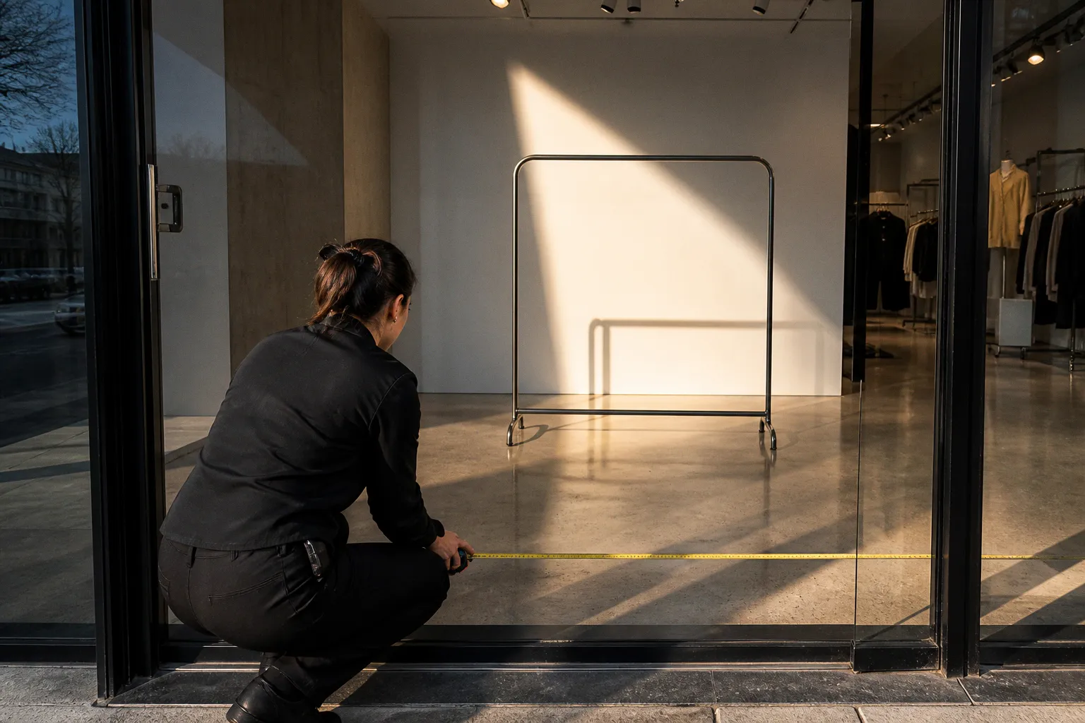
A window display can fail before the first mannequin is dressed. The usual culprit is not a weak concept or a lack of “visual impact.” It is a rack that blocks the route, a sign that hides the product, a lighting circuit that cannot support the planned load, or a fixture that looked compact on paper and turns the storefront into a furniture obstacle course.
I have installed enough retail fixtures to distrust the phrase “space-saving” unless someone can show me the footprint, the service clearance, and the route customers will actually walk. Retail window display planning is less about filling glass with attractive objects and more about controlling access, sightlines, verticality, power, safety, and the painful business of changing everything again next season.
This pre-installation checklist is built around those friction points. It is aimed at retailers preparing a storefront visual merchandising scheme, whether the display uses garment racks, mannequins, shelving, props, signage, digital screens, or a modular combination of all five.
Start with the route, not the rack
The first drawing should show movement. The second can show fixtures.
A window display has two traffic systems to accommodate:
- the public route outside the storefront, including the approach to the entrance;
- the internal route from the entrance through the sales floor and toward exits, checkout, fitting rooms, and accessible merchandise.
These routes are easy to compromise because displays are often treated as temporary. A temporary rack is still a rack. A promotional table is still an obstruction if it narrows a required route. “We only put it there for the weekend” is not a safety strategy; it is a confession with seasonal branding.
For U.S. retailers, the 2010 ADA Standards generally call for an accessible route at least 36 inches clear in width. Where a route is narrower than 60 inches, passing spaces measuring at least 60 by 60 inches, or an equivalent T-shaped space, are generally required at intervals of no more than 200 feet. Those dimensions are not a universal layout formula for every store, but they are a useful starting point when drawing a fixture plan.
The clear width is the usable width, not the distance between the edges of two optimistic rectangles on a plan. Measure around:
- rack uprights and base plates;
- mannequin plinths;
- sign supports;
- shelf overhangs;
- baskets and promotional bins;
- temporary stock waiting to be replenished;
- door swings and hardware;
- queue rails and checkout equipment.
A route that measures 36 inches at floor level may become unusable when a garment sleeve hangs into it or a freestanding sign leans six inches farther than the drawing promised. Fixtures should sit outside the path, not merely avoid touching it at one carefully selected point.
The entrance is a pressure zone
Storefront entrances collect competing demands: door clearance, customer hesitation, signage, promotional displays, carts or bags, and the first product story. A display that looks tidy from across the street can create a bottleneck once two people stop to look at it.
Before ordering a fixture, mark the door swing and the area where customers pause after entering. Then allow for the person who stops in the middle of the route to check a phone, adjust a child’s coat, or decide whether the sale sign means 20% off or “up to 20% off, on selected items, with conditions printed somewhere in another building.”
Self-service shelving, racks, hooks, and similar retail fittings are treated broadly in ADA guidance as part of accessible merchandise areas. The fixtures need to be on an accessible route. The shelving itself is not subject to a single ADA reach-range rule in the way many retailers assume, so do not solve the problem by forcing every product onto one “approved” height. The access route and the usability of the merchandise area need to be considered together.
A display is not compact because its frame is narrow. It is compact when customers, staff, products, and emergency movement still have room to function around it.
Do not confuse retail clearance with a legal clearance
There is no single federal U.S. number that determines the correct aisle width for every retail display format. The often-repeated 28-inch figure comes from OSHA guidance for retail fireworks displays. It should not be copied into a garment store, cosmetics shop, or general merchandise plan as though it were the universal retail minimum.
The same fireworks guidance refers to display heights of no more than 6 feet in the main sales area and no more than 12 feet around the perimeter. Those figures are specific to that setting. They are not a general height rule for clothing racks, window props, or ordinary retail fixtures.
The practical lesson is less exciting than a universal number, but more useful: separate code-driven requirements from merchandising preferences. A display may be visually effective at 8 feet, structurally stable at 10 feet, and still unsuitable because it interferes with sprinklers, sightlines, lighting access, or fire protection. One measurement rarely settles the whole argument.
Build the display around physical constraints
The most attractive layout is usually the one that survives contact with the building.
Before installation, document the window bay and surrounding wall with actual measurements. Record the width, depth, height, sill height, mullion positions, door locations, outlet locations, ceiling obstructions, sprinkler heads, HVAC grilles, and any changes in floor level. Photograph the space from customer eye level, from the entrance, and from the opposite side of the sales floor. A plan that only shows the storefront straight on leaves out the angles where most bad decisions become obvious.
For garment displays, measure the full operating footprint rather than the rack’s advertised width. Include:
- end caps and feet;
- caster rotation;
- the depth of hanging garments;
- clearance needed to remove a hanger;
- staff access behind or beside the rack;
- the space required for a stepladder or maintenance access;
- the swing of any movable panel or hinged sign.
A 48-inch garment rack can easily need more than 48 inches of practical width once a shopper must stand beside it, pull out a garment, and let another customer pass. Verticality helps, but only when the upper levels remain serviceable. A tall rack that requires a ladder for every size adjustment is not efficient. It is a storage problem wearing a black finish.
Use modularity where the campaign actually changes
Modular fixtures earn their footprint when they can be reconfigured without rebuilding the storefront. Look for systems with interchangeable shelves, adjustable arms, removable back panels, and standard hardware. But modularity is not automatically a virtue. Some systems are modular only in the brochure: every change requires proprietary brackets, a special tool, or a call to someone who charges by the cheerful hour.
For a seasonal window display, ask how many components can be changed without removing the main structure. A useful system may allow you to:
1. change the product height without moving the base;
2. swap a hanging rail for shelves or hooks;
3. relocate signage without drilling new holes;
4. remove props while keeping the lighting infrastructure;
5. break down into manageable pieces for storage;
6. fit through the back-of-house route and the stockroom door.
Retrofitting is often cheaper than replacing a complete fixture package, but only if the original system has spare capacity. Confirm the available mounting points, load ratings, bracket compatibility, and adjustment range before assuming that a new shelf will fit an old upright.
Load capacity is a working number
Manufacturers commonly publish load ratings, but the headline number may assume ideal loading, even distribution, correct anchoring, and a perfectly level surface. Retail rarely supplies all four.
A clothing rail loaded with lightweight garments behaves differently from a shelf carrying folded denim, boxed footwear, or display props made from dense materials. Dynamic loads also matter. Customers pull products forward, lean on shelves, move hangers in groups, and occasionally treat a fixture like a convenient handrail. The last behavior is not listed in the merchandising concept, but the rack will experience it anyway.
For each fixture, record:
| Planning item | What to establish before installation |
|---|---|
| Rated load | The manufacturer’s stated capacity and the conditions attached to it |
| Working load | The realistic product and prop weight used in daily operation |
| Point loading | Whether weight sits evenly across a shelf or concentrates at brackets and ends |
| Anchoring | Wall, floor, ceiling, counterweight, or freestanding arrangement |
| Stability | Resistance to tipping when a product is pulled or a customer leans against it |
| Service access | Space for replenishment, cleaning, repairs, and seasonal changes |
| Future changes | Whether new shelves, rails, screens, or signage can be added safely |
If the fixture is near glazing, do not assume the glass is a convenient structural surface. Confirm what can be drilled, what must remain untouched, and whether the landlord or building engineer requires a specific anchoring method. A beautiful suspended display is less impressive when the only support detail is “the installer will figure it out.”
Treat lighting and power as part of the fixture plan
Retail display lighting is often added after the rack is selected, which is how retailers end up with visible cables, overloaded outlets, glare on the glass, and a display that looks excellent at noon and exhausted by evening.
Begin with the visual task. Are you lighting the product, the background, the signage, the mannequin’s face, or the route toward the entrance? These are different jobs. A bright window is not necessarily a readable window. Light pointed directly at glass can create reflections that turn the display into a mirror, especially at night.
A lighting plan should identify:
- fixture type and mounting position;
- beam spread and aiming direction;
- dimming or switching zones;
- color temperature;
- color rendering performance;
- heat output;
- cable routing;
- maintenance access;
- compatibility with existing circuits and controls.
CRI, or Color Rendering Index, is a commonly used way to describe how lighting renders merchandise colors. It is not the whole lighting specification, but it matters when the display depends on accurate fabric, skin, leather, or paint tones. A red garment that shifts toward orange under poor lighting has not become more persuasive because the lamp has a fashionable name.
For dynamic displays, calculate the connected load before installation. Add the wattage of track heads, LED strips, screens, media players, chargers, rotating mechanisms, and any seasonal equipment. Then check the circuit, outlet location, plug access, and switching arrangement. A display that requires staff to unplug three fixtures to vacuum the floor has been designed around the photograph, not around the store.
Plan for maintenance while the display is still empty
Lighting failures are rarely scheduled for a convenient afternoon. If a lamp, driver, screen, or cable connection cannot be reached without dismantling the entire window, the maintenance cost will quietly consume the supposed efficiency of the display.
Leave a service route to:
- replace lamps or drivers;
- clean glass and shelves;
- reset digital equipment;
- inspect fixings;
- remove dust from LED channels;
- change campaign graphics;
- retrieve dropped products.
Do not hide power supplies inside sealed decorative boxes unless someone can open them without damaging the display. “Concealed” should mean visually controlled, not permanently imprisoned.
Design for attention without turning the window into noise
Research on visual merchandising supports a measured conclusion: layout, color, lighting, signage, and product arrangement can influence attention, navigation, and time spent in a store. It does not establish a universal percentage increase in sales from one particular window formula. Anyone promising a guaranteed uplift from three mannequins and a backlit slogan is selling certainty because certainty photographs well.
Eye-tracking research has examined how shoppers attend to products, information signs, and price signs. One field study involved 344 subjects viewing 32 live plant displays across six North American locations. That is useful evidence about attention, but it is not direct proof of how every apparel shopper responds to every clothing window. Another field study of 175 grocery customers found that signage helped shoppers detect displayed products and increased visual attention, with results varying according to store familiarity and the shopper’s stage of navigation or decision-making.
For a garment storefront, the takeaway is straightforward: signage should help the shopper understand the display, not compete with it.
Give every element a job
Before installation, assign a role to each visible object:
- Hero product: the item that earns the first look.
- Context product: the piece that shows how the hero item is used or worn.
- Price or offer message: the commercial information needed to act.
- Brand or campaign message: the reason this display exists now.
- Directional cue: information that moves the shopper toward the entrance or a relevant department.
- Negative space: the area that prevents all of the above from collapsing into visual static.
If every element is a hero, the window has no hierarchy. It becomes a group project where nobody agreed who was presenting.
Mannequin styling should support the product story while leaving enough clearance for dressing and removal. There is no authoritative universal rule for mannequin pose, outfit count, viewing angle, or the number of products in an apparel window. Use the actual sightlines of the storefront. A pose that reads from the sidewalk may fail from the side, where the mannequin’s arm blocks the garment detail or the outfit disappears behind a mullion.
Measure the display from the primary approach direction, not only from the centerline. Many pedestrians see the window obliquely while walking. This affects the order of mannequins, the placement of text, and whether a low product stand becomes a useful foreground layer or a low obstacle that blocks everything behind it.
Control density
Product density is not the same as product variety. A window can show several categories while preserving one clear message, or it can show one category so densely that no item can be understood.
A workable pre-installation test is to photograph the proposed setup from:
- 10–15 feet away;
- the normal sidewalk approach;
- the store entrance;
- the opposite side of the window;
- evening conditions with the planned lighting.
Then look for the first three things visible in each image. If the price sign, a cable, and an empty bracket win over the product, the hierarchy needs work.
Use verticality carefully. Raising a product can create a stronger sightline, but it also affects safe access, replenishment, and perceived scale. Tall perimeter elements can frame a display; tall central elements can block it. The right answer depends on window height, pedestrian distance, product category, and the building’s existing visual clutter.
Make seasonal changes a logistics exercise
Seasonal window display logistics are often planned as if the only task is changing the props. In reality, the changeover includes unpacking, sorting, cleaning, dressing, relighting, graphic replacement, product transfer, photography, storage, and sometimes a trip to the hardware store because one “universal” bracket has developed a very specific personality.
Build the fixture package around repeatable changeovers. Standardize where possible:
- shelf and rail dimensions;
- graphic sizes;
- mounting points;
- cable lengths;
- fastener types;
- prop containers;
- labeling for stored components;
- instructions for lighting scenes and product placement.
Keep a component inventory with photographs. Label parts by position, not just by object name. “Black bracket” is not a useful storage label when there are fourteen black brackets and only two fit the upper rail.
A seasonal installation should have a defined changeover window. If the display requires a full day of dismantling, a day of repairs, and another day of installation, the campaign has a longer operational tail than its concept deck suggests. The schedule should include time for:
1. removing merchandise and fragile props;
2. photographing the previous layout for reference;
3. checking the existing hardware;
4. cleaning the glass, floor, and fixture surfaces;
5. installing the new structure;
6. testing lighting and power;
7. checking routes and sightlines;
8. dressing products and mannequins;
9. inspecting from outside during daylight and after dark;
10. storing the removed components securely.
The storage footprint belongs in the original plan. If the store has nowhere to keep the previous campaign, the back room will become a graveyard of bent sign holders and unidentified acrylic parts. That is not seasonal flexibility. That is delayed disposal.
Coordinate with landlords, engineers, and local authorities
A storefront may feel like the retailer’s territory, but the building still has opinions.
Landlord approvals may be required for drilling, hanging loads, electrical changes, exterior signage, window films, facade attachments, or work that affects glazing and fire systems. Historic districts and shopping centers can add restrictions on materials, colors, lighting hours, sign dimensions, and installation methods. Local building, fire, electrical, accessibility, and preservation requirements may go beyond federal ADA and OSHA material.
OSHA defines an exit route as a continuous and unobstructed path of exit travel from any point in a workplace to a place of safety. Merchandise, equipment, props, temporary fixtures, and display materials cannot be placed within that route simply because the display is temporary or attractive from the street.
Before the crew arrives, assemble the approvals and technical information in one place:
- fixture drawings with dimensions;
- anchoring and load details;
- electrical load schedule;
- lighting layout;
- material and finish information;
- glass and glazing restrictions;
- fire and sprinkler clearance information;
- accessible route plan;
- installation method and working hours;
- removal and reinstatement requirements.
If the storefront is in a multi-tenant building, coordinate deliveries and installation access. A rack may fit through the sales-floor entrance and still fail at the service elevator, loading dock, corridor turn, or stockroom door. Confirm the route with the largest assembled component, not the smallest box shown in the product listing.
Keep emergency systems visible and serviceable
Do not place display structures where they interfere with sprinklers, fire extinguishers, alarm devices, exit signs, emergency lighting, electrical panels, or required access zones. The correct clearance depends on the applicable system and local requirements, so obtain the relevant approval rather than borrowing a number from another project.
The same applies to glass. Window props, suspended products, and hard-edged fixtures should be reviewed for impact risk, stability, and cleaning access. A display close to glazing needs a deliberate answer to what happens if a product falls, a fixture shifts, or a customer presses against the glass.
This is where a good installer becomes irritating in the useful way. If the plan has no answer for a loose cable, a damaged bracket, a blocked panel, or a failed light driver, the plan is not finished.
The installation-day inspection
The display is not complete when the last screw is tightened. It is complete when the physical space works with real people in it.
Walk the finished installation from the customer’s approach and from the staff side. Push a realistic number of hangers along the rail. Open the doors. Pull products forward. Move a cleaning trolley. Stand beside the mannequin. Read the sign from the intended distance. Check the display at the busiest point of the day if possible.
Look specifically for:
- narrowed or blocked accessible routes;
- protruding corners and unstable props;
- pinch points at brackets, hinges, and sliding panels;
- glare or reflections on glass;
- hot surfaces or inaccessible power supplies;
- signs hidden by garments or mannequin limbs;
- products that cannot be reached without a ladder;
- fixtures that wobble when loaded;
- cables crossing staff or customer paths;
- obstructed exits, panels, extinguishers, or emergency equipment;
- lighting that makes dark garments disappear;
- components that cannot be removed without dismantling the whole display.
The 36-inch accessible-route figure alone does not prove ADA compliance. Entrances, doors, turning spaces, protruding objects, checkout aisles, sales counters, and other applicable requirements also need review. Treat the route measurement as one part of the inspection, not a certificate of completion.
The final test is not whether the window looks finished. It is whether a customer can approach, understand, access, and leave the display without negotiating with it.
A practical reality check before you order
I use this short list before approving a display package. It catches more problems than another round of mood-board revisions.
- The footprint includes the working footprint. The plan accounts for garments, hangers, shoppers, staff, door swings, and service access—not just the steel frame.
- The route remains usable. The display does not narrow an accessible path, create a passing problem, or occupy an exit route.
- The fixture has a real load plan. Capacity, anchoring, point loading, tipping resistance, and future additions are documented.
- The hardware is genuinely modular. Components can be changed with available tools, standard parts, and a reasonable amount of patience.
- The lighting has a circuit behind it. Load, controls, cable routes, heat, glare, and maintenance access are resolved before installation.
- The product hierarchy is visible. One message leads. The rest support it instead of shouting over it.
- The display works from the sidewalk. It has been viewed from the actual approach angles in daylight and after dark.
- The changeover is timed. Seasonal logistics include cleaning, repairs, product handling, storage, testing, and reinstatement.
- Approvals are in writing. Landlord, building, fire, electrical, accessibility, and local requirements have been addressed where applicable.
- Nobody needs to improvise on installation day. If the plan depends on drilling a mystery surface or borrowing a mystery ladder, it is not a plan yet.
The best retail window display is not the one with the most objects, the tallest structure, or the most expensive lighting package. It is the one that uses the available verticality without stealing usable clearance, creates attention without visual congestion, and can be changed without a small demolition project every six weeks.
Space optimization is not about squeezing more into the storefront. It is about removing the friction that makes the space feel smaller than it is. A rack should support access. A sign should clarify. A light should reveal. A modular system should earn its extra brackets. If the display does those jobs reliably, it is ready to install. If it merely looks convincing in a rendering, keep the drill in the case.