Eye level display rack height: finding the conversion sweet spot
Every fixture rep worth their commission will give you the same advice: put the merchandise at eye level. As if those three words settle the question of why one endcap attracts hands while a mid-aisle gondola collects dust.
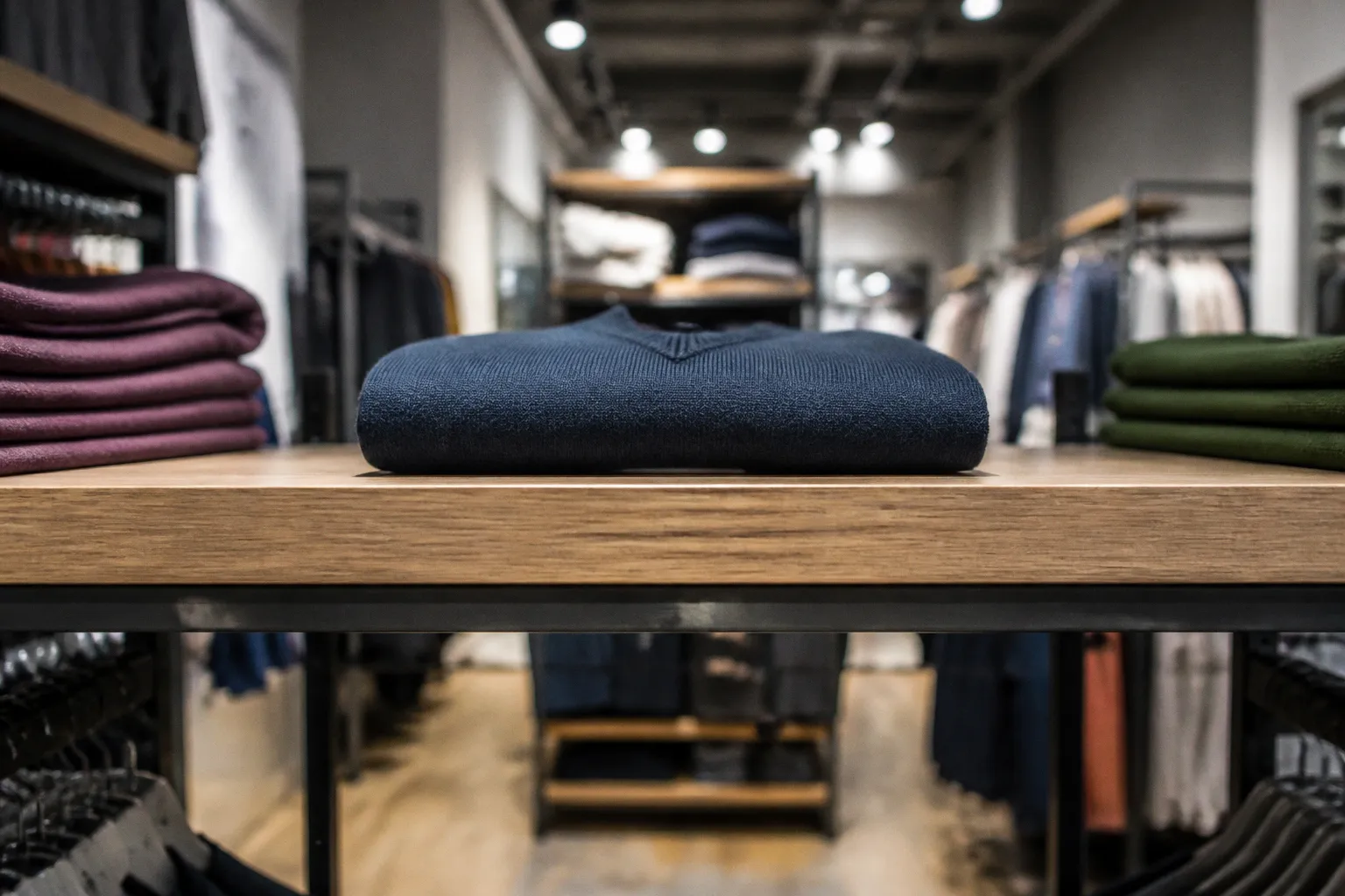
The phrase appears in showroom conversations, vendor decks, and floor-planning meetings with the confidence of a universal law.
The problem is that “eye level” is not a single number. It is a working range, and the useful point inside that range depends on who is walking your floor, what you are displaying, how fast shoppers move, and whether the fixture can hold its position without wobbling like a card table.
A commonly cited merchandising benchmark places the strongest adult attention band between 50 and 54 inches from the floor. Products positioned there can attract materially more attention than the same merchandise placed on lower shelves. That does not mean every item at 52 inches will convert, or that a lower shelf is automatically a commercial failure. It means height changes the probability of being noticed, touched, and considered.
The distinction matters. A display rack is not just a storage frame with clothes on it. Its height controls the first visual encounter, the ease of the next reach, and the amount of effort a shopper must spend before deciding whether an item deserves attention.
The Science of the 50-Inch Strike Zone: Why Height Drives Attention
Start with the anatomy. An adult’s natural line of sight—the horizon where the eyes rest without deliberately tilting the head up or down—usually falls somewhere between 48 and 60 inches from the floor. That is a broad band, but not every point within it performs equally well.
The more useful working zone is narrower: roughly 50 to 54 inches, or about 1,270 to 1,371 millimeters. This is the area often described as the “strike zone” in retail display planning. It is close enough to a shopper’s natural gaze to be noticed without conscious effort, yet low enough for most adults to reach and inspect a product without stretching.
Why does a four-inch difference matter? Human eyes do not scan a shelf as evenly as a barcode reader. The gaze jumps, pauses, and moves on. Merchandise that catches a fixation—not just a peripheral blur, but a real pause of attention—has a better chance of becoming part of the shopper’s consideration set.
That is particularly important in apparel. A garment hanging directly in the natural sightline can communicate color, silhouette, and category before the shopper has read a sign. Move the same garment too high and it becomes part of the store’s architecture. Move it too low and it disappears behind other fixtures, bags, strollers, or the shopper’s own walking posture.
The frequently used 50-to-54-inch benchmark should not be treated as a magic formula. A shopper’s sightline changes with posture, speed, footwear, age, mobility, and the amount of visual competition in the aisle. A narrow rack in an uncluttered boutique behaves differently from a densely stocked fixture in a busy department store. Still, the benchmark is a useful starting point for retail rack sightline optimization because it gives a merchandising team something more precise than “somewhere around eye level.”
The strike zone is not a universal constant. It is a practical starting point for deciding which products deserve the easiest visual access on the floor.
The commercial value of the zone comes from reducing friction. A shopper does not need to raise their chin, bend their knees, move around a neighboring fixture, or make a deliberate decision simply to see what is available. The product enters the field of attention while the shopper is already moving. From there, lighting, color contrast, price communication, product relevance, and fixture spacing determine whether attention becomes engagement.
Height starts the process. It does not finish it.
Why “higher” is not automatically more visible
Retailers often confuse visibility with elevation. A garment suspended above the surrounding fixtures may be technically visible from a long distance, but that does not mean it is easy to understand or reach. At excessive heights, the shopper sees the top edge, shoulder line, or hanger rather than the full product.
High placement also changes the angle of inspection. Shoppers looking upward tend to gather less detail, particularly when the item is soft, dark, or partially obscured by other merchandise. The garment may work as a color signal or brand cue, but it is less likely to invite a quick touch.
This is why the best height for garment display racks is usually a compromise between sightline and hand access. A hero item can sit higher if it functions primarily as a visual marker. A product that depends on fabric inspection, label reading, or comparison with adjacent sizes should sit where the shopper can reach it naturally.
Mapping the Vertical Reach: From Adult Sightlines to Accessible Design
Seeing a product is only the first step. Reaching it is the second, and this is where simplified visual merchandising advice tends to fall apart.
A broadly useful adult reach range runs from approximately 750 millimeters to 1,700 millimeters from the floor—about 30 to 67 inches. That does not mean every inch in this range is equally comfortable. The upper edge is a deliberate reach. The lower edge requires bending. Neither is ideal for an item that depends on impulse discovery.
The upper portion of a rack can carry visual information, but it should be assigned carefully. Signage, a brand message, a color story, or a single styled garment can work above the main interaction zone. A densely packed run of jackets at the top of a fixture is a different proposition. Shoppers may notice the line of product, but many will not pull down an item simply to find out whether it is worth considering.
The lower section creates the opposite problem. Anything below roughly 30 inches asks the shopper to bend or crouch. People will do that for a product they already want. They are less likely to do it for an unknown garment, an accessory discovered while passing through, or a product that has not yet earned their effort.
That gives each vertical band a different commercial role:
| Height zone | Approximate floor distance | Likely shopper behavior | Suitable use |
|---|---|---|---|
| Prime sightline | 50–54 in (1,270–1,371 mm) | Catches a natural glance and can prompt a touch | New arrivals, hero products, high-margin pieces |
| Comfortable reach | 36–50 in (914–1,270 mm) | Easy to grab, inspect, compare, and return | Core inventory, size runs, repeat purchases |
| Extended reach | 54–67 in (1,371–1,700 mm) | Visible, but requires a deliberate action | Signage, supporting colorways, brand storytelling |
| Low interaction zone | 24–36 in (610–914 mm) | Requires bending or crouching | Children’s products, bulk merchandise, accessible overflow |
| Below 24 in | Under 610 mm | Often overlooked by standing adults | Backstock or storage rather than primary display |
This is the practical meaning of merchandise placement height standards. They are not instructions to fill every level equally. They are a way to decide what each level is supposed to accomplish.
Accessibility changes the layout, not just the fixture specification
Accessibility should be treated as a design constraint from the beginning, not as a note added after the rack has been ordered. Accessible reach requirements and local regulations vary by market, store format, and fixture type, so the exact specification must be checked against the rules that apply to the location. The merchandising principle is consistent: a display should not place all meaningful interaction above the comfortable reach of a significant group of shoppers.
The adult sightline sweet spot at 50 to 54 inches may sit above the most comfortable interaction range for some wheelchair users. That creates a real planning tension. If every hero product is hung at 52 inches, the store may optimize the first glance while making the next step unnecessarily difficult for customers who cannot approach the rack or reach from a seated position.
A layered display solves more of the problem than a single “perfect” bar height:
1. Place the primary visual hook around the adult sightline. This can be a featured garment, a coordinated color group, or a concise product message.
2. Keep a touchable version, size run, or related item in the comfortable reach zone. The lower placement should not feel like an afterthought or a separate category of merchandise.
3. Use the lower band intentionally when children or seated shoppers are part of the audience. Lower product visibility can be especially important in children’s apparel, where the wearer may influence the purchase even when the adult completes the transaction.
4. Avoid making the accessible option harder to understand. If the only reachable garment is a sample while the sizes and colors are hidden elsewhere, the layout has technically provided access but still created friction.
Layering consumes vertical and horizontal space. That is the cost. The benefit is a display that supports more than one posture, reach pattern, and shopping behavior.
Adapting Display Layouts for Diverse Shopper Demographics
“Eye level” assumes an average shopper who is standing upright, moving at a moderate pace, and browsing in a clear aisle. Real store traffic is less cooperative.
Children’s apparel
Children’s clothing exposes the weakness of adult-centered sightline planning. A parent may scan the fixture from an adult height, while the child notices color, graphics, texture, or a familiar character from much lower down. A jacket hung at 52 inches may be perfectly visible to the parent and nearly irrelevant to the child who will wear it.
For children’s departments, lower hero displays can make sense. The 24-to-36-inch band may be more effective for products designed to attract a child’s attention, while upper sections can carry parent-facing information such as price, material, care details, and size guidance. The point is not to lower every garment. It is to separate the visual audience from the purchasing audience and acknowledge that both may shape the decision.
Taller shoppers and regional differences
The 50-to-54-inch benchmark is most useful when treated as a reference rather than a fixed international law. Average body dimensions vary across markets, and store demographics can differ even within the same city. A retailer serving a notably taller customer base may find that the most comfortable sightline and reach sit slightly higher. A store serving a mixed or highly varied population may need a broader vertical composition instead of one dominant level.
This is also where fixture adjustability earns its keep. A rack designed for one customer profile can become limiting when the assortment, location, or target audience changes. A two- or four-inch adjustment may seem minor on a planogram, but it can change whether a garment is read as a product or merely as part of the background.
Older shoppers
For an aging customer base, the comfortable reach zone often narrows. Bending may become less casual, overhead reaching may be less appealing, and prolonged searching through a tightly packed rack can become tiring. In that setting, the practical prime zone may move closer to the middle of the 36-to-50-inch band, particularly for products that require handling.
Spacing matters as much as height. A garment positioned correctly but packed tightly against its neighbors is not genuinely easy to use. The shopper still has to separate hangers, identify sizes, and remove an item without disturbing the entire row. The best height for a garment display rack is therefore inseparable from the amount of clearance around the garment.
Shoppers with different mobility and posture needs
A floor plan should support more than one standing eye line. Some shoppers approach from a wheelchair or mobility aid. Others may be shorter, moving with a child, carrying bags, or looking at the store from a seated position. A display that works only for a person of average height standing directly in front of it is not optimized; it is narrowly optimized.
Use the primary band to attract attention, then provide a clear path to inspect the product at a more accessible level. Keep price and size communication legible from different angles. Avoid placing critical information only on a top rail or overhead sign. These small decisions affect whether the rack feels inviting or quietly tells part of the audience to move on.
Strategic Fixture Selection for Optimal Merchandise Visibility
All the theory about height becomes academic if the display rack cannot hold the required position. This is the unglamorous part of visual merchandising: the hardware determines how much of the strategy survives contact with the sales floor.
Many standard garment racks arrive with a fixed bar height. That may be acceptable for a stable assortment and a predictable audience, but it limits retail rack sightline optimization when the merchandise changes. A bar positioned somewhere between 54 and 66 inches may look reasonable in a catalog image while placing the most important part of the garment above the strongest natural gaze on the actual floor.
Adjustability is useful, but only if it is practical. A system that requires a tool, a ladder, and a maintenance request for every change will not be adjusted often enough to support active merchandising. Tool-free adjustment or a simple locking mechanism is more valuable than a long list of theoretical positions.
When comparing commercial display racks, focus on the parts that affect real use:
- Adjustment range: Can the system cover the interaction zones you actually need, including lower accessible positions and the prime adult sightline?
- Adjustment increments: Can the bar be set close to the intended target, or does the fixture force a choice between noticeably too high and noticeably too low?
- Stability at working height: A rack that supports its rated load near the floor may behave differently when the same load is raised. Check for sway, tilt, and movement at the height where merchandise will hang.
- Load distribution: Heavy denim, coats, and densely packed knitwear create different demands from light shirts or accessories. The fixture should remain stable when the assortment is full, not only when it is displayed sparsely.
- Base and footprint: A wider base can improve stability, but it also consumes selling-floor space. Include shopper clearance when calculating the footprint. A rack that achieves a perfect height but constricts the aisle has created a different problem.
- Crossbar and bracket compatibility: Existing frames may support an adjustable bar, shelf, or secondary hanging rail. Retrofitting can preserve the useful parts of a current system, but only when the frame and connectors are rated for the modification.
- Visual obstruction: Thick uprights, deep shelves, and oversized sign holders can interrupt the sightline even when the merchandise is positioned at the correct height.
- Reconfiguration speed: Seasonal changes, category moves, and promotional resets all favor fixtures that one person can adjust safely without dismantling the display.
A stable rack also protects the perception of quality. A garment that sways every time someone removes a hanger feels less considered, even if the merchandise itself is strong. Stability is not merely a safety requirement; it is part of the visual message.
A fixture that cannot hold its target height under a real merchandise load is not solving a merchandising problem. It is moving the problem from the planogram to the customer’s hands.
The garment itself determines the useful height
The bar height is only one measurement. The visual center of the product may sit several inches below it, depending on hanger size, garment length, shoulder construction, and the amount of space above the rail.
A short blouse and a long coat should not be evaluated by the same reference point. If the rack bar is set at 52 inches but the garment’s strongest visual feature hangs at chest level or is hidden below neighboring pieces, the display may miss the intended sightline. For longer garments, consider where the collar, closure, print, or key texture appears from the aisle—not simply where the hanger is attached.
This is especially relevant for mixed-height displays. A top rail can provide an attractive silhouette while a lower rail carries folded items or accessories. But if the upper garments overlap the lower merchandise, the result is visual compression rather than layered storytelling. Each level needs enough breathing room to be read as a distinct offer.
Balancing Ergonomics and Inventory Density in Modern Floor Plans
The ergonomic sweet spot is a narrow slice of the total vertical space available in a store. That creates an unavoidable tension between visibility and inventory density.
A rack filled from floor to ceiling may hold more garments, but capacity alone does not tell you how well the merchandise is working. Some pieces will sit above the most natural sightline. Others will be too low for casual discovery. A dense display can also make it harder to distinguish color, size, and silhouette, particularly in apparel where the product needs to be handled before purchase.
That does not mean a sparse rack will automatically outperform a dense one. Lower-density displays may improve engagement when the product benefits from visual separation, when shoppers need to inspect fabric or shape, or when the assortment is premium and discovery-led. In other categories, a fuller rack may be appropriate because customers arrive with a specific need, compare several sizes, or expect broad choice. The result depends on product category, garment dimensions, price positioning, shopper demographics, and the quality of the surrounding layout.
The useful question is not whether the rack holds 20 or 40 garments. It is whether the additional garments improve choice or simply increase search effort.
The commonly cited 35% attention difference between eye-level and lower placement can help frame the decision, but it does not establish a universal sales outcome. Attention is an opportunity, not a guarantee. A product still has to be relevant, priced appropriately, easy to understand, and available in the right size. Treat the figure as a reason to protect prime sightline space for the merchandise most likely to benefit from being discovered—not as proof that every lower-density rack will outsell every denser one.
A practical tiered strategy looks like this:
1. Prime sightline, around 50–54 inches: Place new arrivals, high-margin pieces, seasonal statements, or products with strong impulse potential. These items should benefit from being noticed without a deliberate search.
2. Comfortable reach, around 36–50 inches: Place core inventory, size-organized basics, and products shoppers are likely to compare. This is often the most useful zone for garments that need to be removed and examined.
3. Upper zone, around 54–66 inches: Use for brand communication, supporting color stories, visual balance, or a limited number of display pieces. Do not rely on this area for the full selling assortment.
4. Lower zone, below 36 inches: Assign it to children’s merchandise, accessible secondary displays, bulk products, or staff-accessible stock where the purchase decision is already more deliberate.
This approach is not about reducing assortment for the sake of a cleaner photograph. It is about matching density to decision-making. Products that need touch and comparison require room to be found. Products bought through replenishment or a known mission can tolerate more concentration.
Linear footage and vertical efficiency
The height decision also affects how much merchandise can be shown along a run of fixtures. A rack with wide spacing and a lower density may use more linear footage per garment, but it can make the category easier to scan. A compact rack may protect floor capacity while increasing visual noise.
Measure both outcomes:
- how many relevant products are visible from the main approach;
- how many can be reached without moving neighboring items;
- whether shoppers can identify sizes and categories quickly;
- whether the aisle remains wide enough for two-way movement;
- whether the display creates a stopping point or a blockage.
The best layout is rarely the one with the highest theoretical capacity. It is the one that gives the right products enough visual and physical access while preserving a comfortable customer path.
Testing the Layout Before You Commit
The gap between a fixture catalog and a working sales floor is measured in practical annoyances. Before approving a rack system, test the layout in the environment where it will actually operate.
Measure the customer sightline
Do not measure only the rack. Observe the people approaching it. Stand at the department entrance and follow the route a typical shopper takes. Note where the gaze naturally lands as the shopper moves, turns, or passes another fixture. A product can be at the correct height and still be missed if the approach angle is wrong.
Check the view from more than one position:
- the main aisle;
- the department entrance;
- the neighboring category;
- the point where shoppers slow down;
- the place where they are most likely to turn away.
This reveals whether the display works as a first signal, a browsing destination, or neither.
Load the rack before evaluating it
An empty fixture always looks more capable than it is. Add the actual merchandise, including the heavier items that will occupy the rail during a busy trading period. Then adjust the rack to its planned position and look for sway, tilt, bracket movement, or uneven loading.
The relevant question is not whether the rack reaches 52 inches. It is whether it remains stable at 52 inches with a full run of garments attached.
Check the floor and the approach
Retail floors are not always perfectly level. Small variations can change the apparent height of a bar from one side of an aisle to the other, especially on tall or narrow fixtures. Use a level where appropriate, but also assess the visual result from the shopper’s position.
Then walk the customer path. A rack that invites interaction must leave enough space for the shopper to stop without blocking the main route. If people have to turn sideways to pass, the fixture’s visibility gain may be outweighed by circulation problems.
Test different bodies and postures
A useful trial includes more than one person. Compare the view and reach of shoppers of different heights, someone seated, someone carrying a bag, and someone approaching from the side rather than head-on. The goal is not to find a single perfect measurement. It is to identify where the layout stops being comfortable and whether the lower or secondary display compensates for that limitation.
Watch behavior, not just opinions
Teams often evaluate a rack by asking whether it “looks good.” That is necessary but insufficient. Watch whether shoppers pause, separate hangers, touch the featured items, read the information, and return merchandise without creating a tangle. A display that photographs well but makes the first interaction awkward is not finished.
The most revealing test is often simple: place comparable merchandise at two different heights and observe whether the difference affects stopping, touching, and searching. Do not treat the result as a universal conversion statistic. Use it as evidence about that category, that fixture, and that customer base.
Finding the Conversion Sweet Spot
The right eye level display rack height for retail is not a number to copy from a generic planogram. The 50-to-54-inch band is a strong reference for adult sightlines, but the commercial decision begins after that benchmark: what is the product, who needs to reach it, how much inspection does it require, and what else competes for attention?
For many stores, the answer is a layered system rather than a single rail. Put the visual hook where the adult gaze naturally travels. Keep the touchable assortment within a comfortable reach. Use lower positions deliberately for children, seated shoppers, and categories that benefit from closer inspection. Reserve upper areas for communication and visual structure rather than treating them as extra capacity by default.
The impact of rack height on conversion is therefore indirect but significant. Height affects attention; attention affects the chance of interaction; interaction creates the opportunity for a sale. The later stages still depend on product, price, presentation, and relevance.
Protect the best sightline for the merchandise that deserves discovery. Make the next reach easy. And measure the result on the floor with a loaded, stable fixture—not in a catalog image where every rack looks perfectly placed.